Guides: Logo Guide
This section displays the CrownPeak Brand Guide for the overall logo and colors.
Building consistency into your designs helps strengthen your brand and keep the brand message clear. Defining consistent relationships between color, photography, typography, illustration, icons, etc., dictates how a user associates with your brand, how they feel about it and how they use it.
Logo [ Main Usage ] Light
This logo displays the [Main Usage] logo that is used on any light background. This logo consists of an Icon, Main Text and Tag Line which have been formatted to balance with each other.
![]()
Logo [ Main Usage ] Dark
This logo displays the [Main Usage] logo that is used on any dark background. This logo consists of an Icon, Main Text and Tag Line which have been formatted to balance with each other.
![]()
Logo [ Vertical ] Light
This logo displays the [Vertical] logo that is used on any light background.
![]()
Logo [ Vertical ] Dark
This logo displays the [Verical] logo that is used on any dark background.
![]()
Usage Application
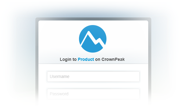
Usage Application Login
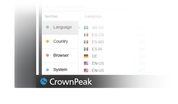
Usage Application Bottom Bar
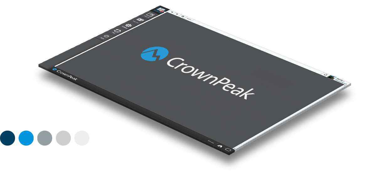
Usage Website
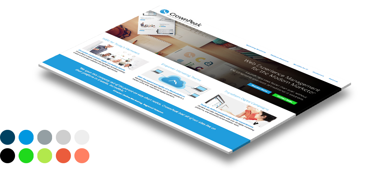

Usage Website Top Bar
Usage Website Bottom Bar
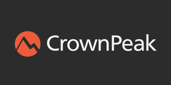
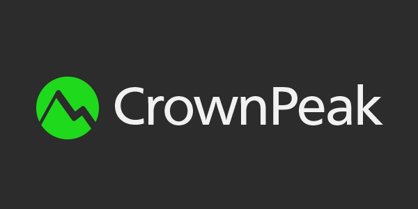
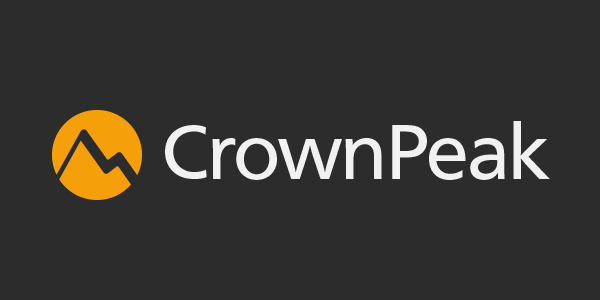
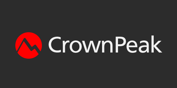
Color Logo Usage
This section displays the logo in many color formats. The basis of these color formats is to breakout key features or aspects of the CrownPeak product that we would like to highlight by differentiating them through color. By choosing a design such as the green logo and using it with the section on the website such as "Optimization" we are creating a color coded style to be carried through the designs.
Original Concepts
Can be viewed at this LINK