Guides: Website Guide
This section displays the CrownPeak Brand Guide for the overall logo and colors.
Building consistency into your designs helps strengthen your brand and keep the brand message clear. Defining consistent relationships between color, photography, typography, illustration, icons, etc., dictates how a user associates with your brand, how they feel about it and how they use it.
13 Template Pages:
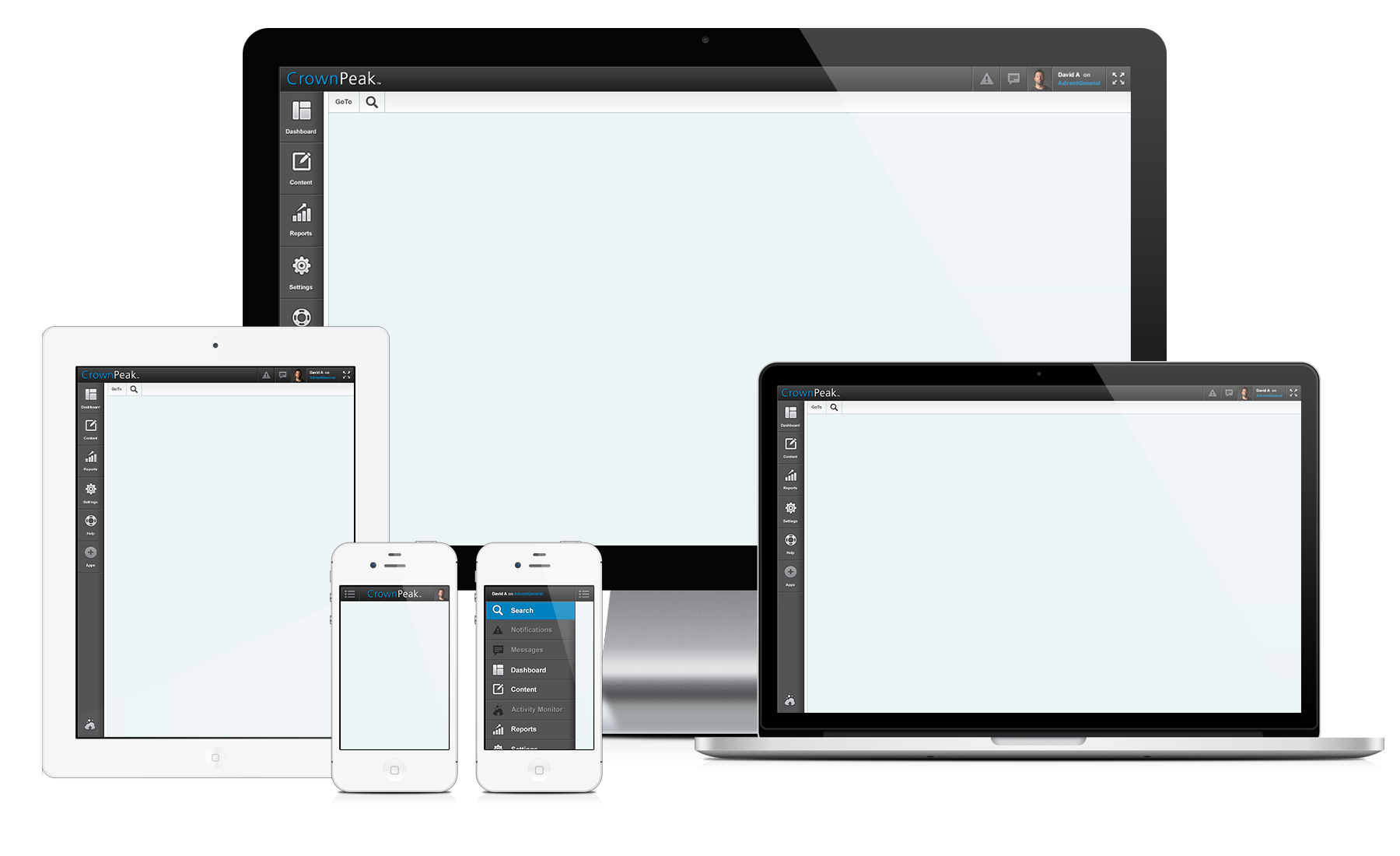
Mobile Device Compatible
Responsible Layout
・ 320 px — Mobile portrait
・ 480 px — Mobile landscape
・ 600 px — Small tablet
・ 768 px — Tablet portrait
・ 1024 px — Tablet landscape/Netbook
・ 1280 px - Tablet landscape/Netbook
Special Details:
・ Tabs
・ Lightbox Windows
・ Menu Open-Close
・ Slideshow
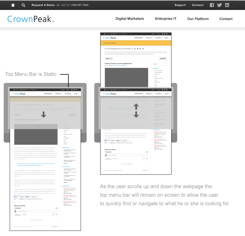
・ Static Top Menu
・ Drop-down Menu
・ Collapsible Mobile Menu
・ Forms and Wizard Forms
・ Pagination
・ Google Web fonts
Fonts Specs:
[All] Title / Quotes: Open_Sans
・ Regular
・ Bold
・ Italic
DOWNLOAD HERE Click Here
[All] Paragraph Text: Arial
・ Regular
・ Bold
DOWNLOAD HERE Click Here
The website will breakdown based off of the users screen size. The specs below are what we have designed to.
・ 320 px — Mobile portrait
・ 480 px — Mobile landscape
・ 600 px — Small tablet
・ 768 px — Tablet portrait
・ 1024 px — Tablet landscape/Netbook
・ 1280 px - Tablet landscape/Netbook
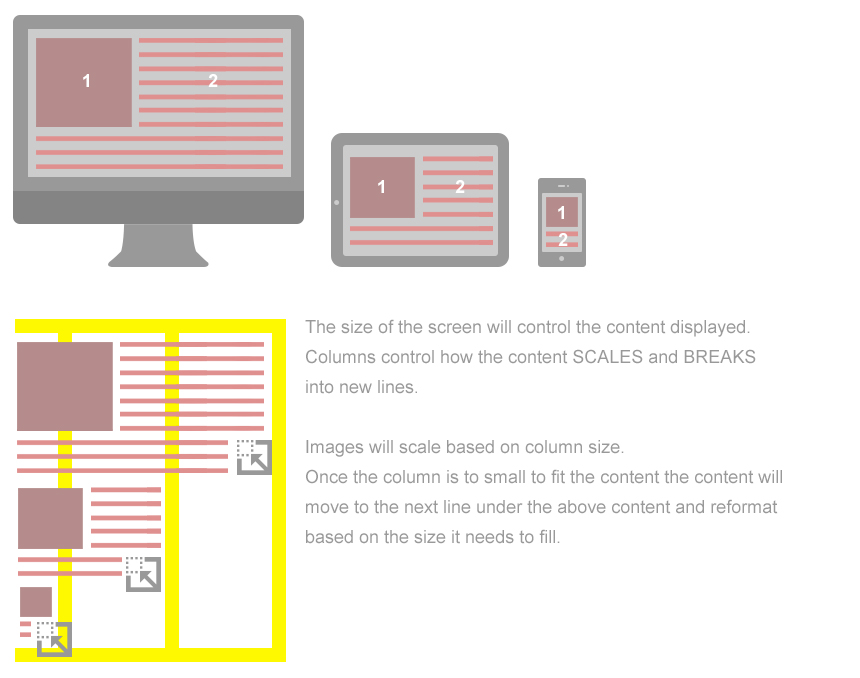
Responsive example of how we expect the images to scale and breakdown can be seen at this link. Click Here
Template Information & Modules
We have built 13 templates which are attached. The idea is to have this website be flexible with the ability to easily change the layouts when needed. To do so we have created the layouts with the idea that "Modules" we will call them here can easily be moved around in any page.
MODULES
Click Here: For the full view of all modules and names. Any one of these modules should be able to be taken and placed onto a page.
http://crownpeak.technology/UI-Website-Guide/guide/File-Modules/
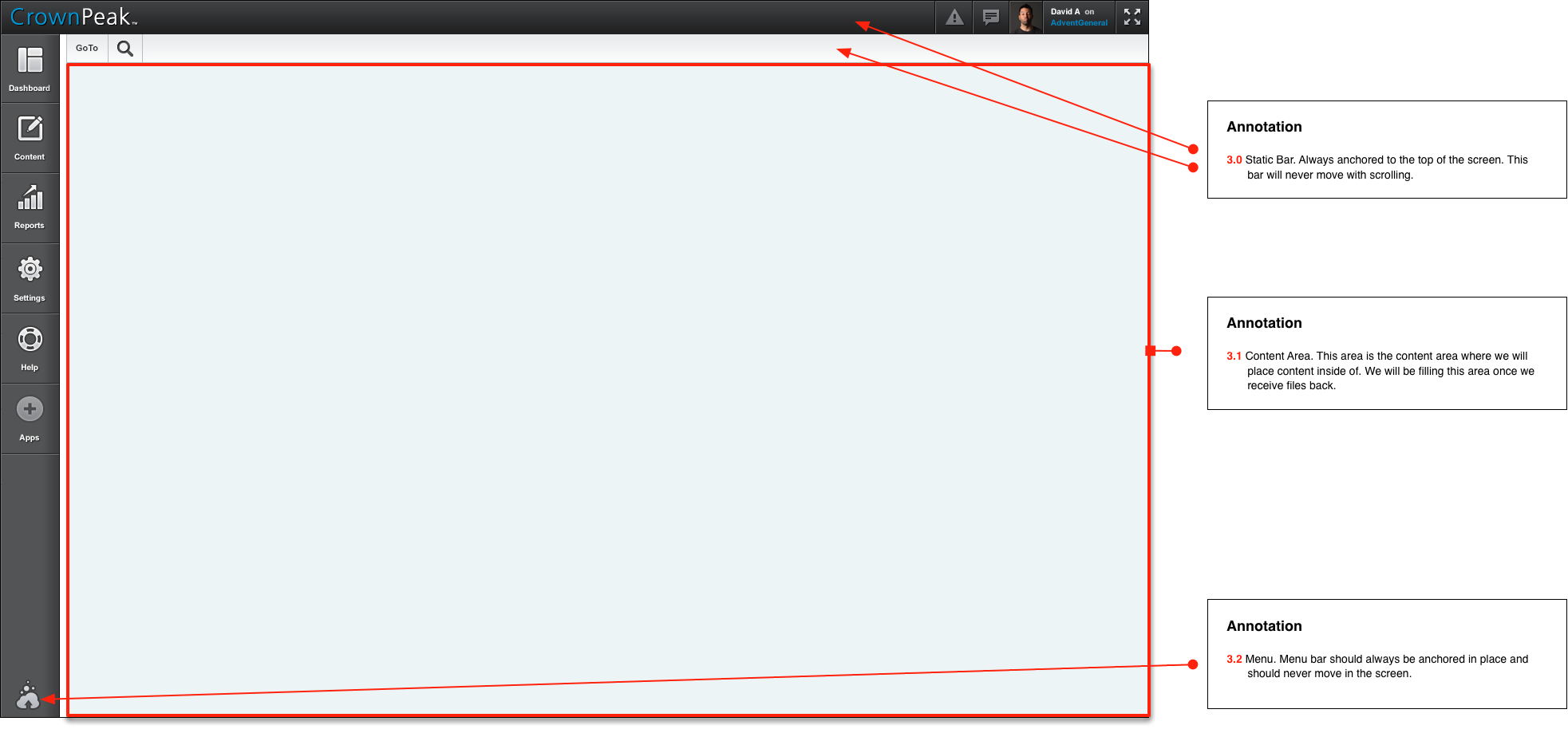
MENU
CONSISTANT ITEMS:
All pages have the same top menu and footer menu.
・ Top Menu
・ Bottom Footer
All pages have modular based layouts.
Template Links & PSD's
Below are the links for each page along with the responsive aspects of each.
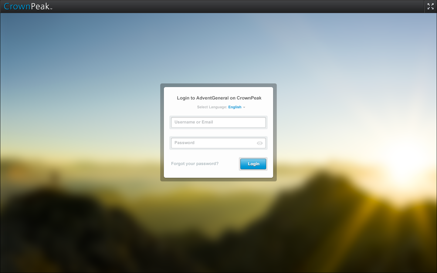
Login: http://crownpeak.technology/UI-Website-Guide/guide/
Username: crownpeak
Password: admin
Note: Grey boxes represent imagery
Top Menu [Responsive]
Click Here: For the full page which you can scroll through all of the sizes vertically.
http://crownpeak.technology/UI-Website-Guide/guide/File-0-Menu/
For each size > 320px / 480px / 600px / 768px / 1024px / 1280px
PSD DOWNLOAD: http://crownpeak.technology/UI-Website-Guide/guide/File-0-Menu.psd.zip
Footer Menu [Responsive]
Click Here: For the full page which you can scroll through all of the sizes vertically.
http://crownpeak.technology/UI-Website-Guide/guide/File-0-Footer/
For each size > 320px / 480px / 600px / 768px / 1024px / 1280px
http://crownpeak.technology/UI-Website-Guide/guide/File-0-Footer.psd.zip
Template 1 [Responsive]
Click Here: For the full page which you can scroll through all of the sizes vertically.
http://crownpeak.technology/UI-Website-Guide/guide/File-1/
For each size > 320px / 480px / 600px / 768px / 1024px / 1280px
http://crownpeak.technology/UI-Website-Guide/guide/File-1-Skeleton-Grid.psd.zip
Template 2 [Responsive]
Click Here: For the full page which you can scroll through all of the sizes vertically.
http://crownpeak.technology/UI-Website-Guide/guide/File-2/
For each size > 320px / 480px / 600px / 768px / 1024px / 1280px
http://crownpeak.technology/UI-Website-Guide/guide/File-2-Skeleton-Grid.psd.zip
Template 3 [Responsive]
Click Here: For the full page which you can scroll through all of the sizes vertically.
http://crownpeak.technology/UI-Website-Guide/guide/File-3/
For each size > 320px / 480px / 600px / 768px / 1024px / 1280px
http://crownpeak.technology/UI-Website-Guide/guide/File-3-Skeleton-Grid.psd.zip
Template 4 [Responsive]
Click Here: For the full page which you can scroll through all of the sizes vertically.
http://crownpeak.technology/UI-Website-Guide/guide/File-4/
For each size > 320px / 480px / 600px / 768px / 1024px / 1280px
http://crownpeak.technology/UI-Website-Guide/guide/File-4-Skeleton-Grid.psd.zip
Template 5 [Responsive]
Click Here: For the full page which you can scroll through all of the sizes vertically.
http://crownpeak.technology/UI-Website-Guide/guide/File-5/
For each size > 320px / 480px / 600px / 768px / 1024px / 1280px
http://crownpeak.technology/UI-Website-Guide/guide/File-5-Skeleton-Grid.psd.zip
Template 6 [Responsive]
Click Here: For the full page which you can scroll through all of the sizes vertically.
http://crownpeak.technology/UI-Website-Guide/guide/File-6/
For each size > 320px / 480px / 600px / 768px / 1024px / 1280px
http://crownpeak.technology/UI-Website-Guide/guide/File-6-Skeleton-Grid.psd.zip
Template 7 [Responsive]
Click Here: For the full page which you can scroll through all of the sizes vertically.
http://crownpeak.technology/UI-Website-Guide/guide/File-7/
For each size > 320px / 480px / 600px / 768px / 1024px / 1280px
http://crownpeak.technology/UI-Website-Guide/guide/File-7-Skeleton-Grid.psd.zip
Template 8 [Responsive]
Click Here: For the full page which you can scroll through all of the sizes vertically.
http://crownpeak.technology/UI-Website-Guide/guide/File-8/
For each size > 320px / 480px / 600px / 768px / 1024px / 1280px
http://crownpeak.technology/UI-Website-Guide/guide/File-8-Skeleton-Grid.psd.zip
Template 9 [Responsive]
Click Here: For the full page which you can scroll through all of the sizes vertically.
http://crownpeak.technology/UI-Website-Guide/guide/File-9/
For each size > 320px / 480px / 600px / 768px / 1024px / 1280px
http://crownpeak.technology/UI-Website-Guide/guide/File-9-Skeleton-Grid.psd.zip
Template 10 [Responsive]
Click Here: For the full page which you can scroll through all of the sizes vertically.
http://crownpeak.technology/UI-Website-Guide/guide/File-10/
For each size > 320px / 480px / 600px / 768px / 1024px / 1280px
http://crownpeak.technology/UI-Website-Guide/guide/File-10-Skeleton-Grid.psd.zip
Template 11 [Responsive]
Click Here: For the full page which you can scroll through all of the sizes vertically.
http://crownpeak.technology/UI-Website-Guide/guide/File-11/
For each size > 320px / 480px / 600px / 768px / 1024px / 1280px
http://crownpeak.technology/UI-Website-Guide/guide/File-11-Skeleton-Grid.psd.zip
Template 12 [Responsive]
Click Here: For the full page which you can scroll through all of the sizes vertically.
http://crownpeak.technology/UI-Website-Guide/guide/File-12/
For each size > 320px / 480px / 600px / 768px / 1024px / 1280px
http://crownpeak.technology/UI-Website-Guide/guide/File-12-Skeleton-Grid.psd.zip
Template 13 [Responsive]
Click Here: For the full page which you can scroll through all of the sizes vertically.
http://crownpeak.technology/UI-Website-Guide/guide/File-13/
For each size > 320px / 480px / 600px / 768px / 1024px / 1280px
http://crownpeak.technology/UI-Website-Guide/guide/File-13-Skeleton-Grid.psd.zip
Template Extra Details
LIGHTBOX NOTIFICATION
http://crownpeak.technology/UI-Website-Guide/guide/File-14/1.1.html
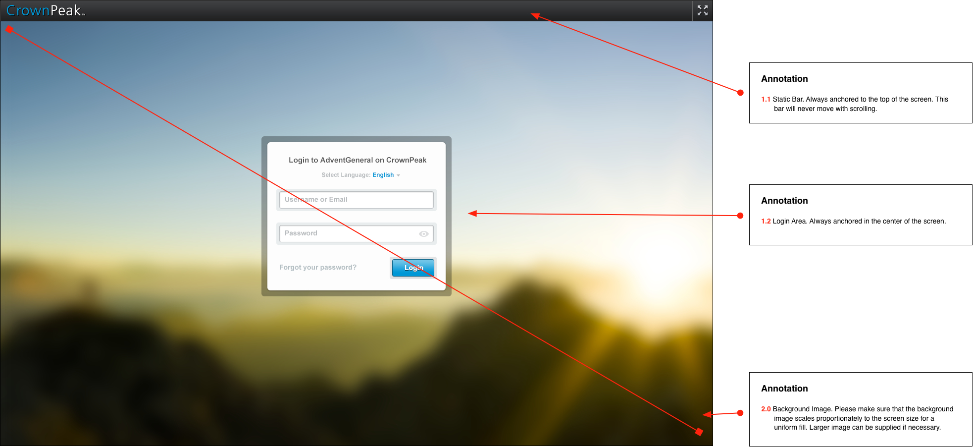
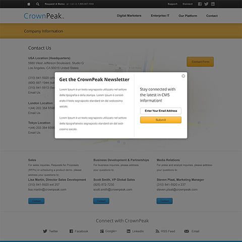
This notification window will open when triggered by our CMS. This window will contain either messages or actions we ask the user for.
LIGHTBOX FORM
http://crownpeak.technology/UI-Website-Guide/guide/File-14/1.2.html
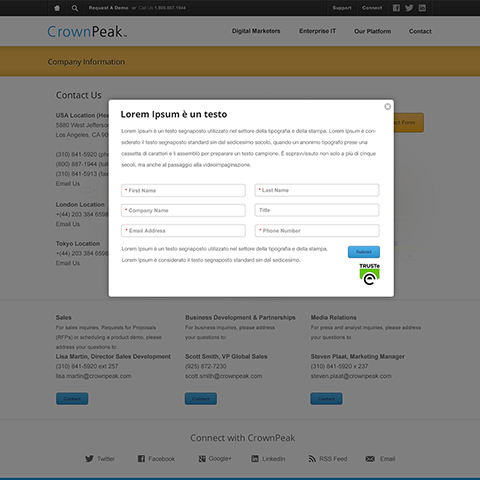
This lightbox window will open when a user clicks the contact form or any link that triggers a form. The window will contain the form fields for users to complete and submit. A success or failure message will display after interaction is completed.
LIGHTBOX CASE STUDIES
http://crownpeak.technology/UI-Website-Guide/guide/File-14/1.3.html
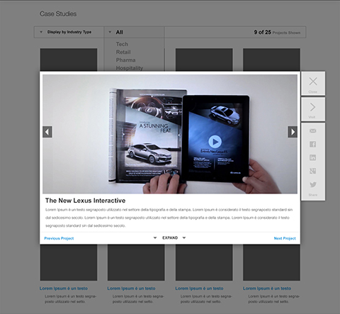
This lightbox window will open when a user clicks a feature or case study. The window will allow the user to view more information about a project or to scroll through images of the projects.
The user will have the ability to share the project through social connections or simply navigate to the next project as needed.
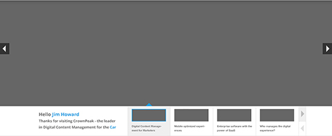
SLIDESHOW
http://crownpeak.technology/UI-Website-Guide/guide/File-14/1.4.html
The slideshow will have
two ways of navigating. 1) Left and Right arrows anchored to the left or right of the screen will allow the user to move to the next slide. 2) Thumbnail/Information tabs at the bottom of the slideshow will allow the user to move to the next slide. When moving to the next slide we will want the ability to select from two interaction styles. Fade or SlideUp.
CODED FRAMEWORK
We have coded 13 templates which are attached. The website pages are responsive using simple single CSS and JS files for fast loading content. All content can be downloaded in a zipped file by clicking here.
Home Page Framework
http://crownpeak.technology/UI-Website-Guide/dev/1.htmlHome Page Framework
http://crownpeak.technology/UI-Website-Guide/dev/2.htmlContent Grid Framework
http://crownpeak.technology/UI-Website-Guide/dev/3.htmlContent Grid Framework
http://crownpeak.technology/UI-Website-Guide/dev/4.htmlAbout Page Framework
http://crownpeak.technology/UI-Website-Guide/dev/5.htmlContact Page Framework
http://crownpeak.technology/UI-Website-Guide/dev/6.htmlBlog Grid Framework
http://crownpeak.technology/UI-Website-Guide/dev/7.htmlBlog Extended Grid Framework
http://crownpeak.technology/UI-Website-Guide/dev/8.htmlPortfolio Grid Framework
http://crownpeak.technology/UI-Website-Guide/dev/9.htmlContent Grid Framework
http://crownpeak.technology/UI-Website-Guide/dev/10.htmlContent Grid Framework
http://crownpeak.technology/UI-Website-Guide/dev/11.htmlContent Grid Framework
http://crownpeak.technology/UI-Website-Guide/dev/12.htmlLanding Page Framework
http://crownpeak.technology/UI-Website-Guide/dev/13.htmlCMS PRODUCT PROTOTYPE
REGULAR PIXEL
Desktop:
1440-by-900 [ Regular ] resolution at 72 (ppi)
Tablet:
1024-by-768 [ Regular ] resolution at 72 (ppi)
Mobile:
568-by-320 [ Regular ] resolution at 72 (ppi)
RETNA PIXEL
Desktop:
2880-by-1800 [ Retna ] resolution at 220 (ppi)
Tablet:
2048-by-1536 [ Retna ] resolution at 264 (ppi)
Mobile:
1136-by-640 [ Retna ] resolution at 326 (ppi)
Page 1.1 - Desktop
View of 1440-by-900 [ Regular ] resolution at 72 (ppi)
Page 1.2 - Tablet
1024-by-768 [ Regular ] resolution at 72 (ppi)
Page 1.3 - Mobile
568-by-320 [ Regular ] resolution at 72 (ppi)
Page 2.1 - Desktop
View of 1440-by-900 [ Regular ] resolution at 72 (ppi)
Page 2.2 - Tablet
1024-by-768 [ Regular ] resolution at 72 (ppi)
Page 2.3 - Mobile
568-by-320 [ Regular ] resolution at 72 (ppi)