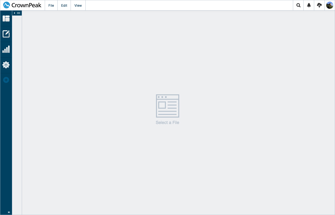
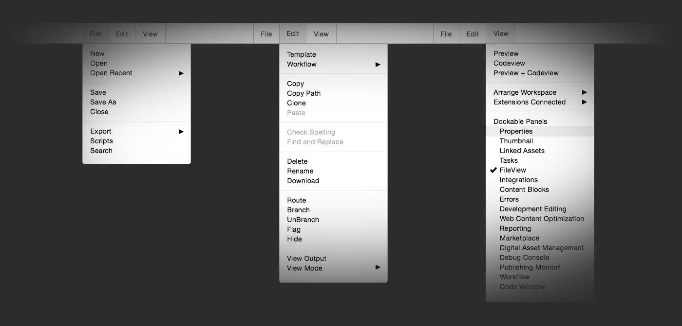
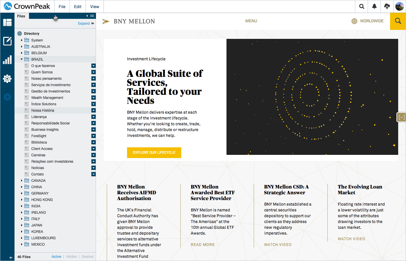
Designs: Content Editing
User Interface screens for the content section of the CMS.
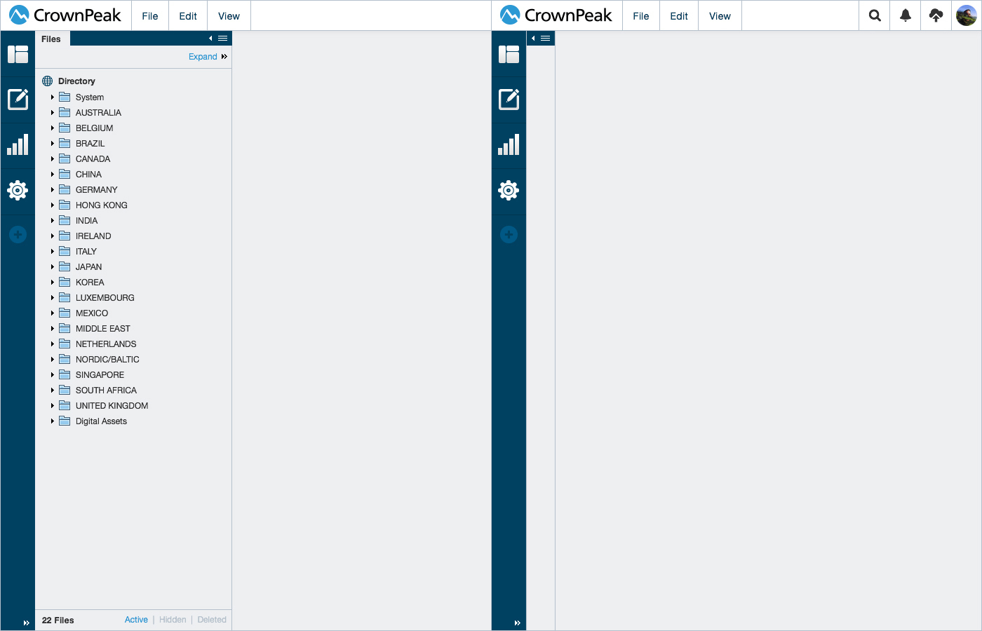
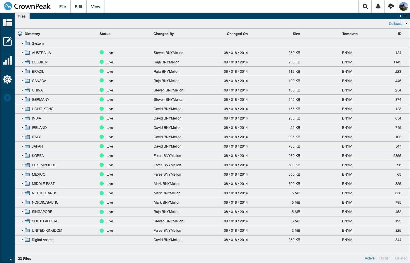
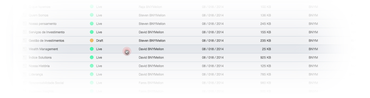
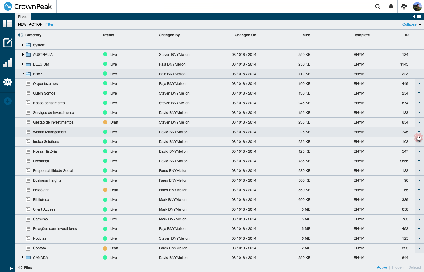
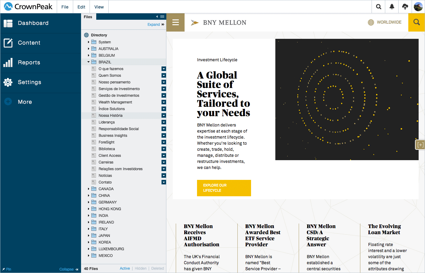
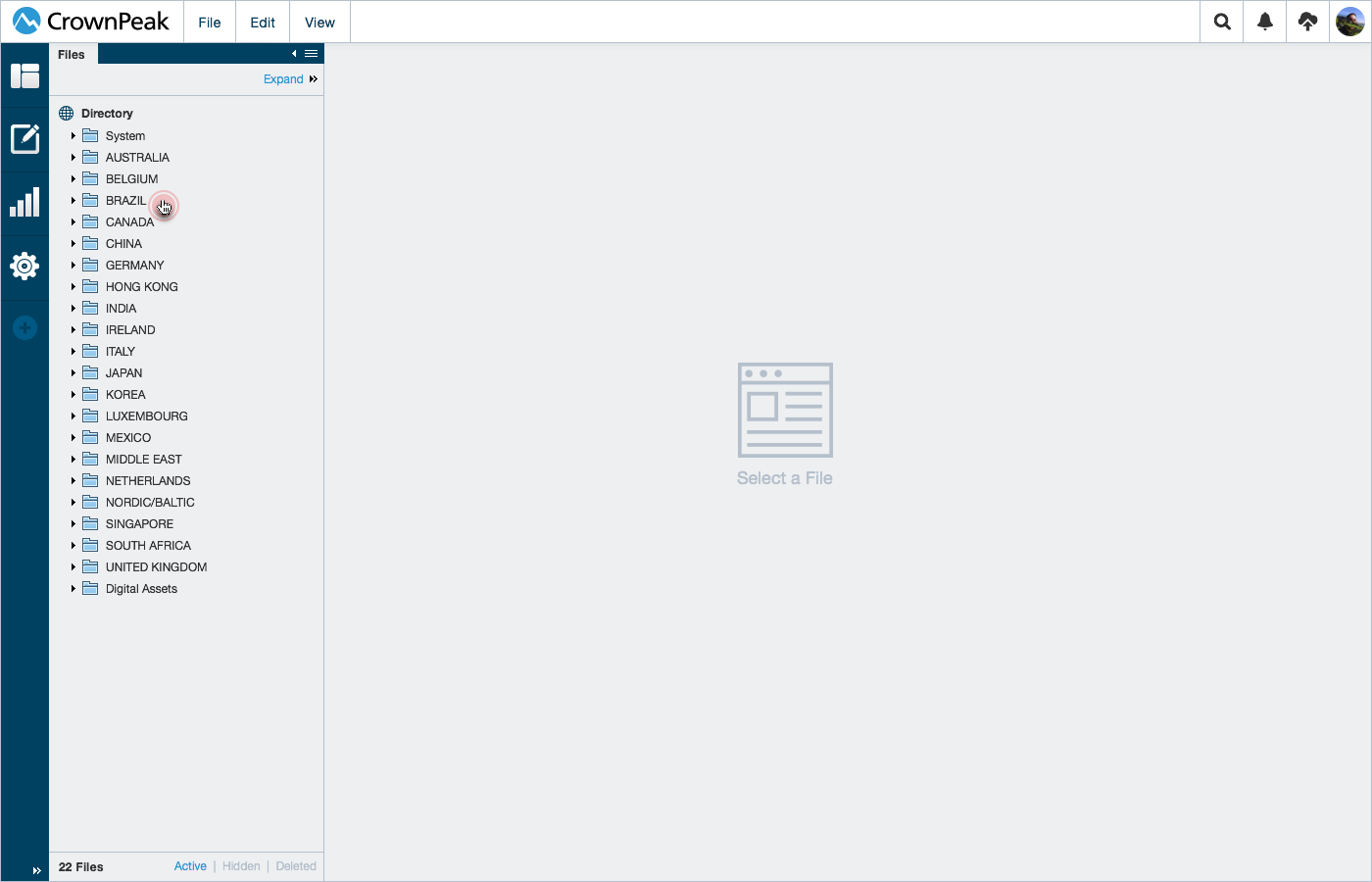
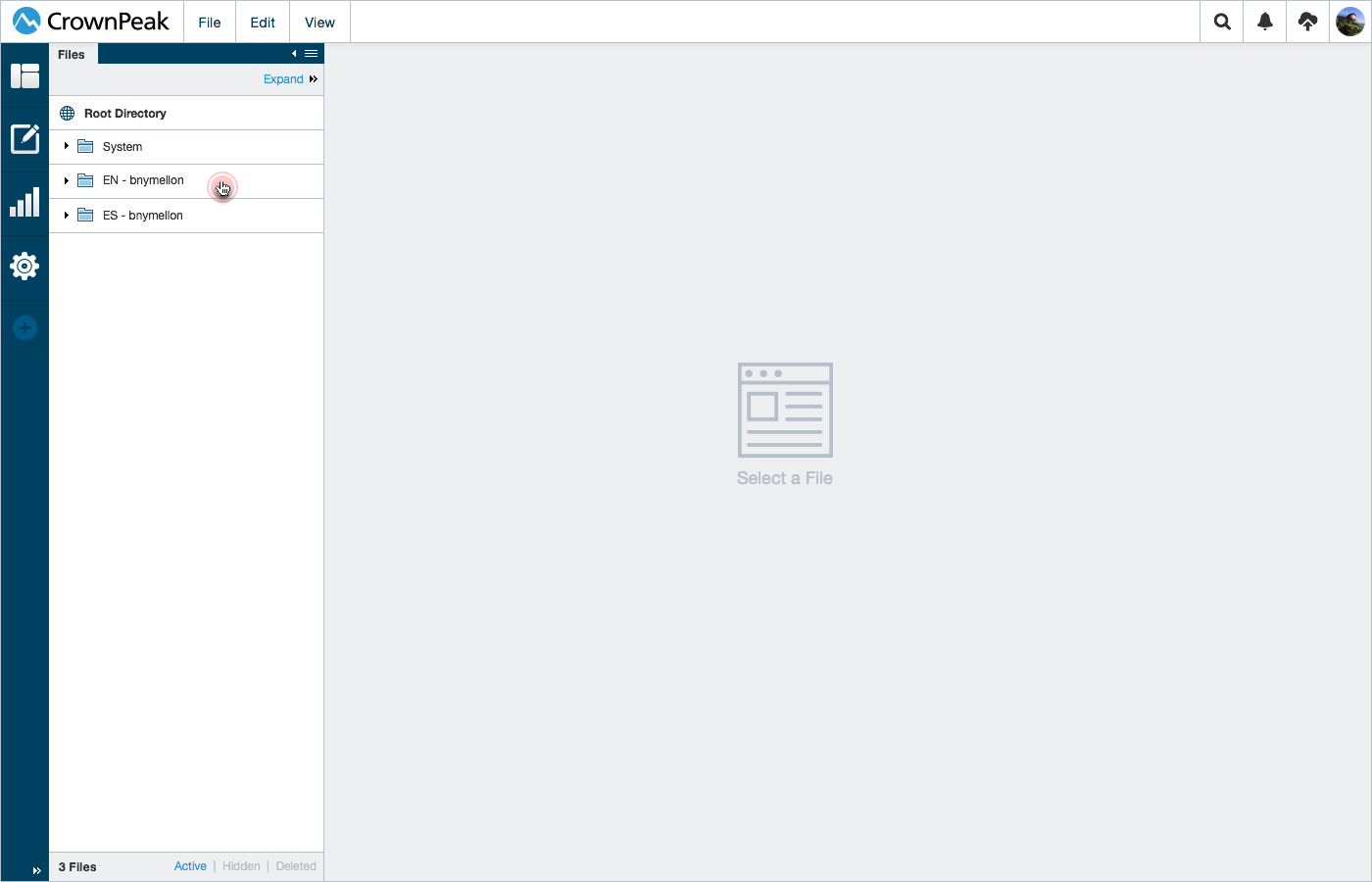
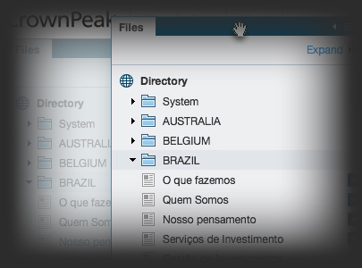
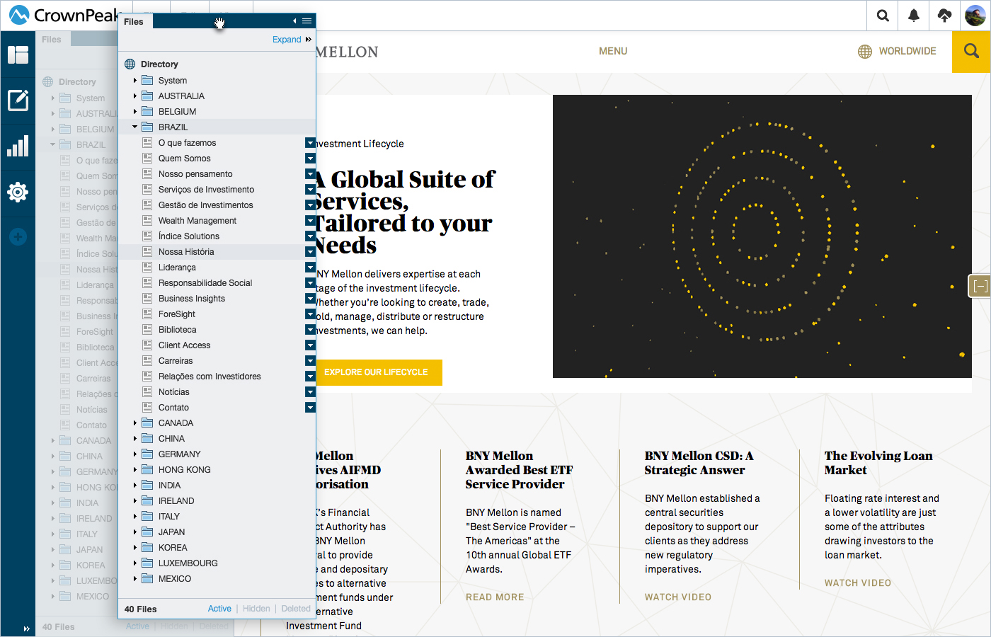
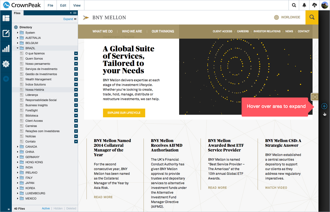
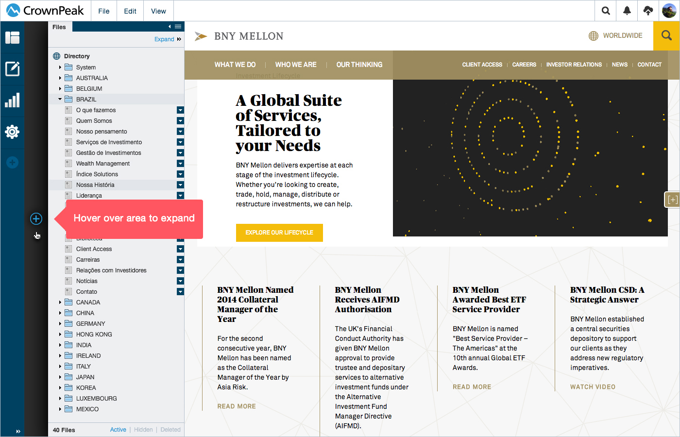
Content: Menu Fileview
This animation showcases the menu and fileview ui for the content section of the cms. Here we see how the user is able to minimize or expand the interface for usability.
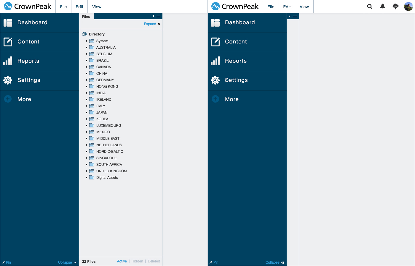
Content: Menu Standard w/ Treeview
Content: Menu Expanded w/ Treeview
Content: Menu Fileview Expanded
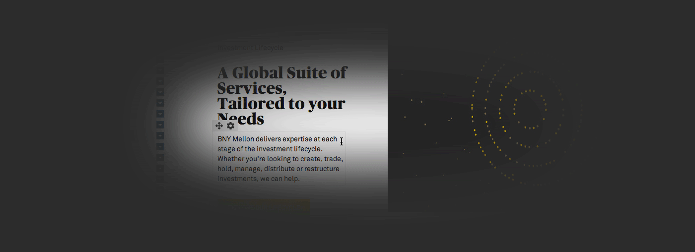
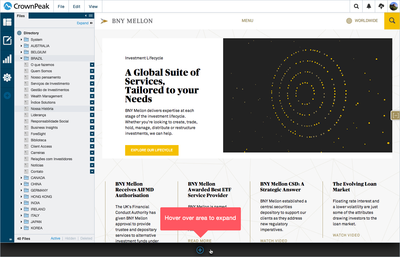
Content: Fileview Click to Open Asset
Content: Menu Standard w/ Treeview Collapsed
Content: Menu Standard w/ Treeview Expanded

Content: Menu Expanded w/ Treeview Collapsed
Content: Menu Expanded w/ Treeview Expanded
Concept 1: Treeview Expandable Folders
Please refer to Picasa Desktop app (http://picasa.google.com/) to get an idea of how this treeview functions.
Concept 2: Treeview Click Into Folders
Please refer to JQuery (http://www.jqueryscript.net/tags.php?/tree%20view/) for further treeview examples.
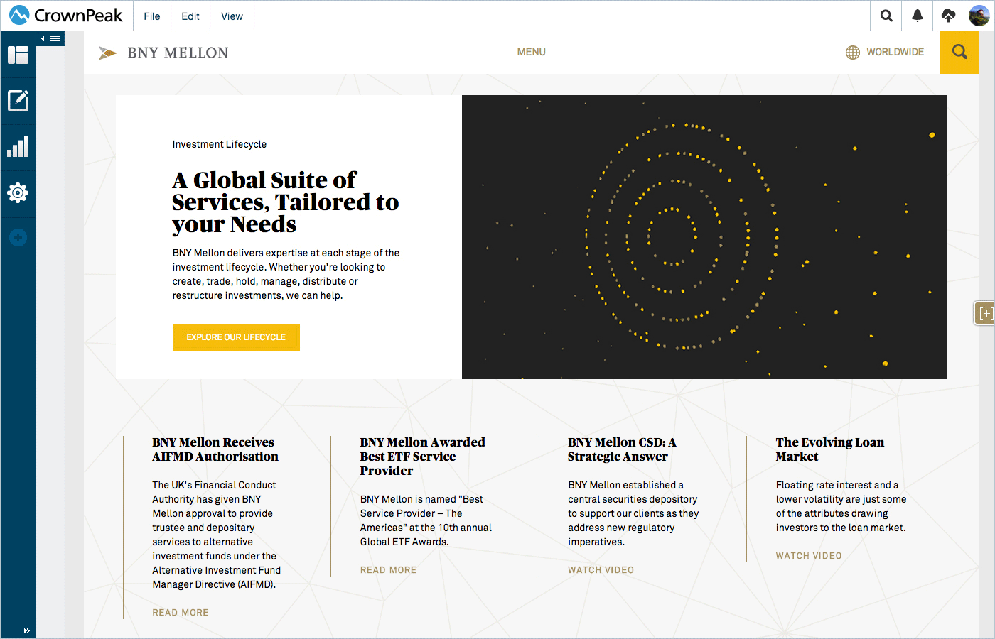
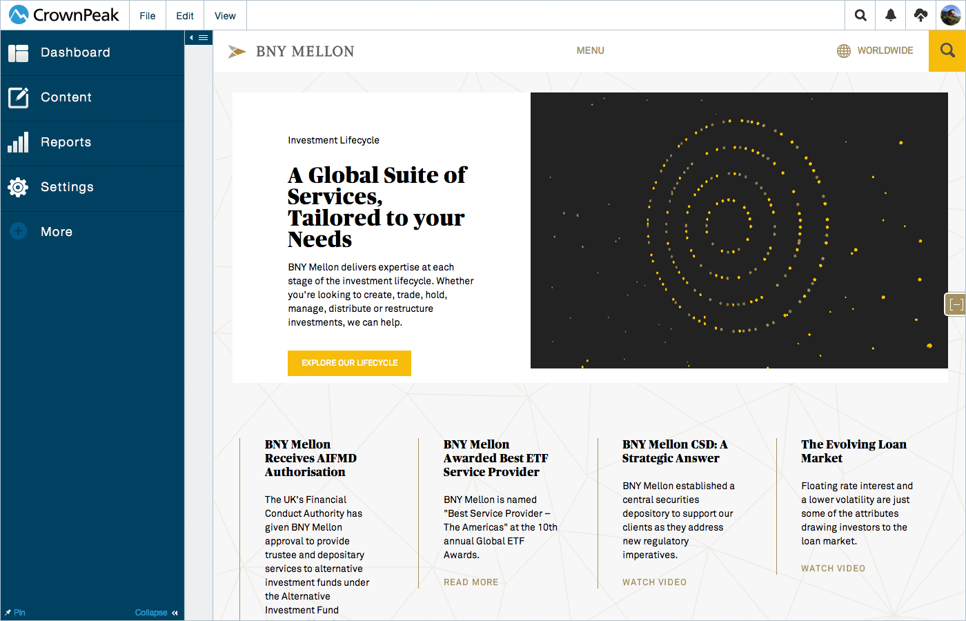
Content: Asset Editing
My focus has been to remove the clutter of the interface allowing the user to focus on the content.
Content: CKEditor Inline Editing Example
Selection
This UI displays how the cursor acts when it rolls over a content area.
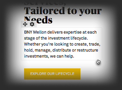
Edit Text
This UI displays how the cursor acts on text edit.
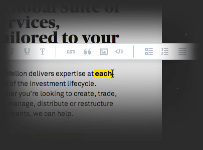
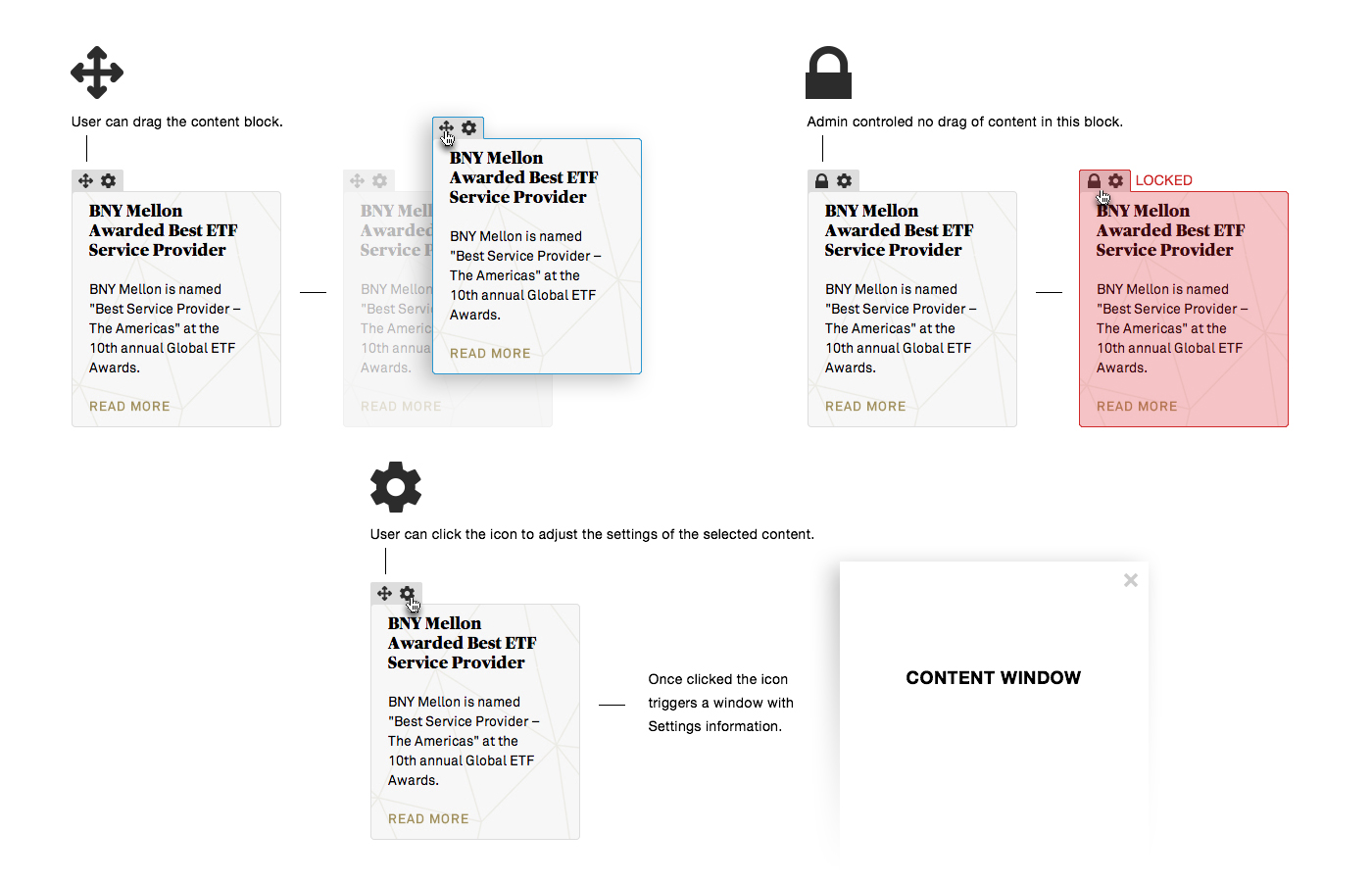
Content Block
This UI displays some of the content editing options.
Content: Hover Selection Areas

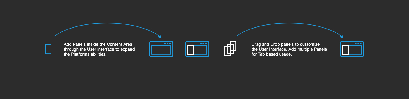
Content: Workspace Customization
Dockable Panels deliver a familiar experience to any developer or user with web experience.
The interface can go from simple to complex simply by adding, moving, expanding and collapsing the dockable panels while still allowing the user to focus on the content.
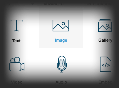
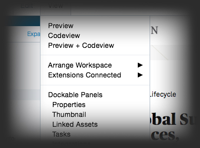
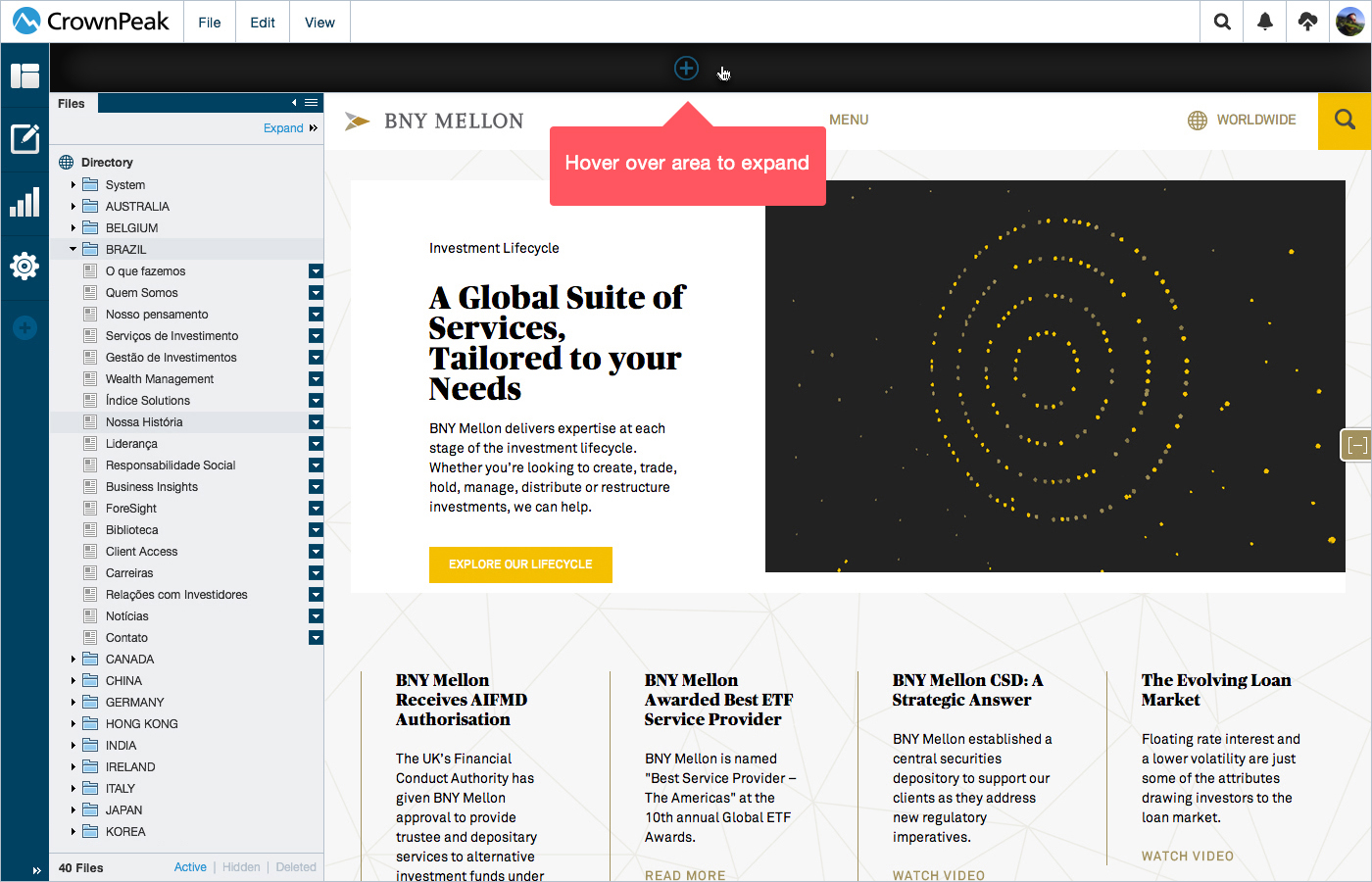
Dropdown Menu
This UI displays how the dropdown menu allows a user to add a dockable panel into the content area.
Dock Hover Expand
This UI displays how the mouse hover on the sides of the browser can allow for adding dockable panels to the content area.
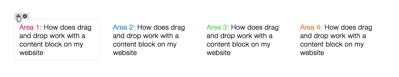
Dock Magnet
This UI displays how the user can drag and drop panels to magnitized areas anywhere in the interface in the content area.
Panel Actions
This UI displays how the Panels will allow direct interaction directly into the interface with Drag and Drop into the content area.
Content: Dockable Panels
The interface can go from simple to complex simply by adding, moving, expanding and collapsing the dockable panels while still allowing the user to focus on the content.

Hover over the edges of the browser and the interface will shift to allow the user to add and select a panel.
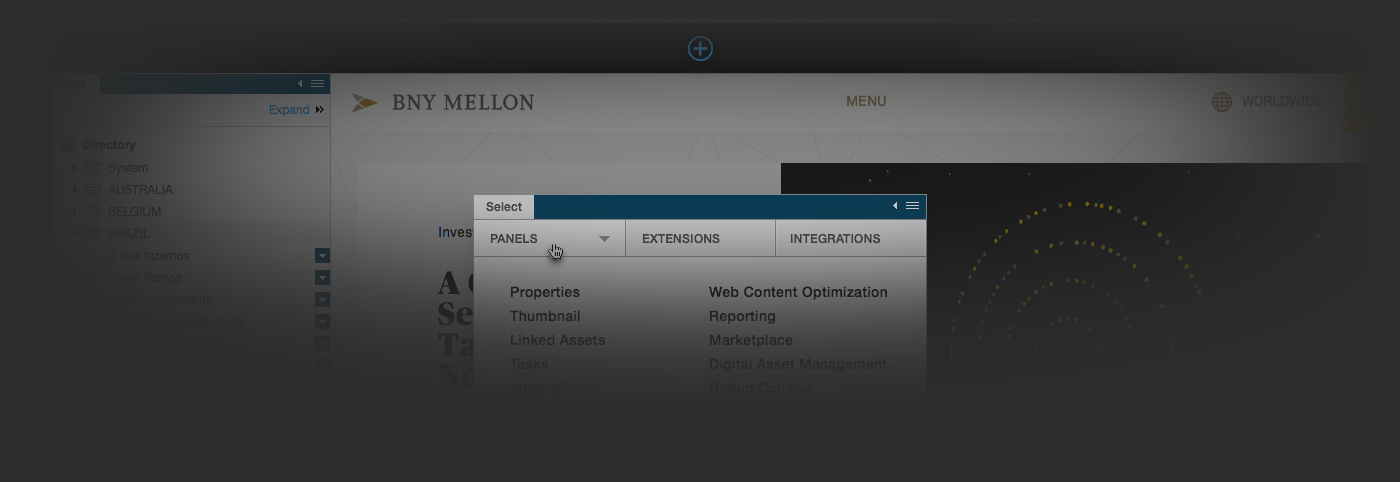
Dropdown menus inside of the content section display how the user can add Dockable Panels and more.
Lorum Ipsom
Lorum Ipsom
Lorum Ipsom
Active Example
These examples focus on the drag and drop abilities of web User Interfaces.
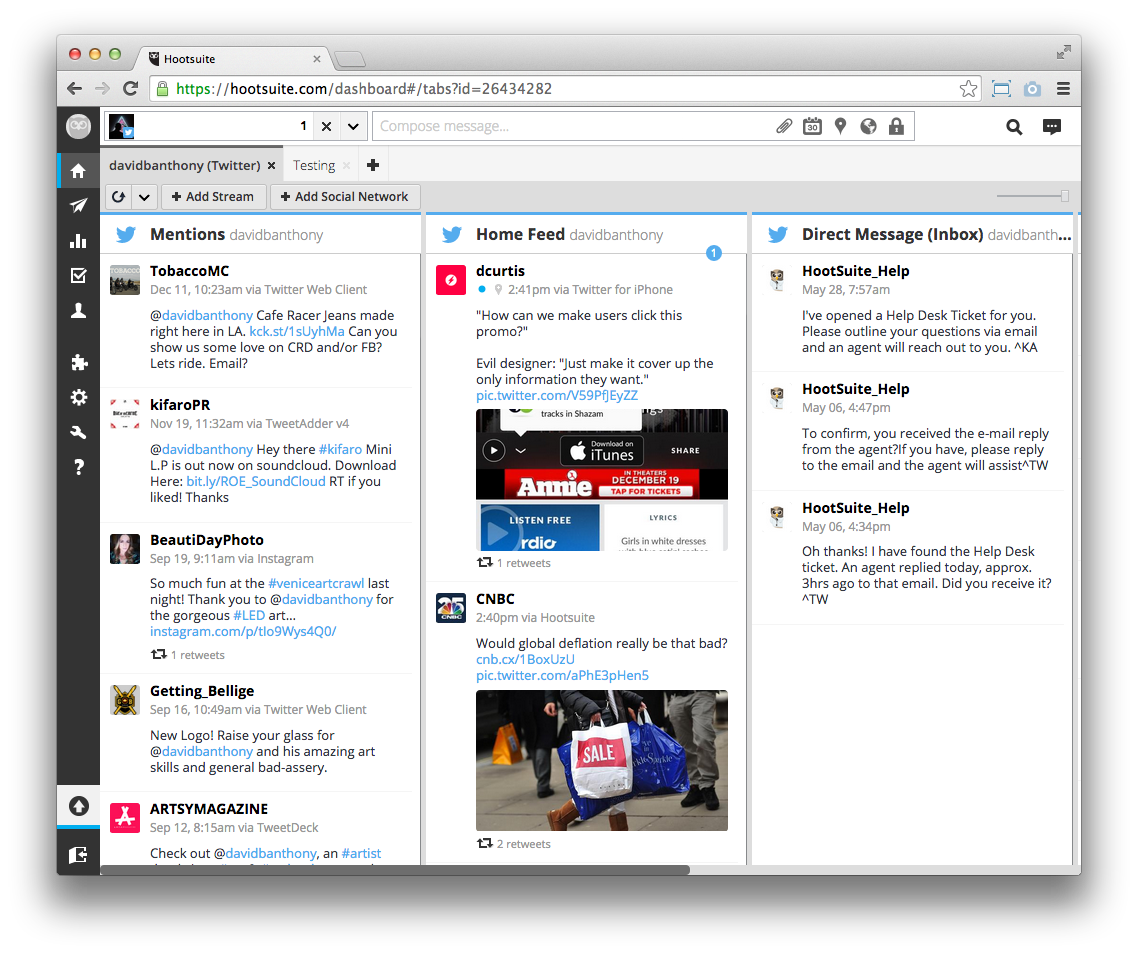 https://hootsuite.com/dashboard#/tabs?id=26434282
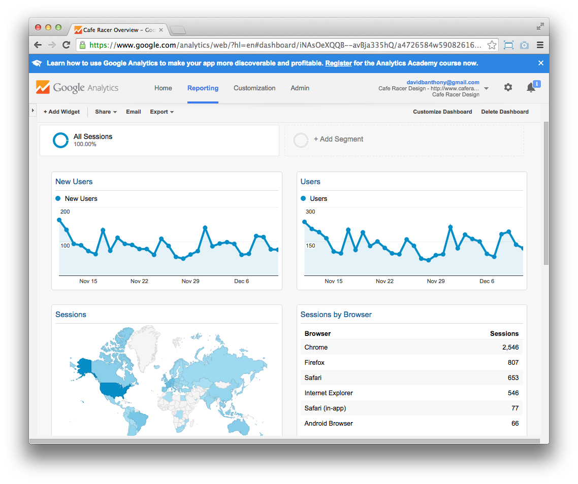 https://www.google.com/analytics/web/?hl=en#dashboard/iNAsOeXQQB--avBja335hQ/a4726584w59082616p60329651/
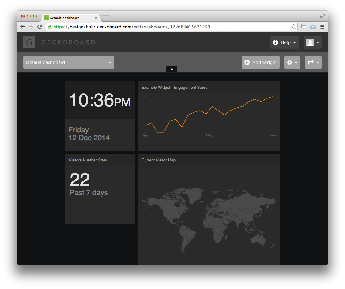 https://designaholic.geckoboard.com/edit/dashboards/122683#15631250
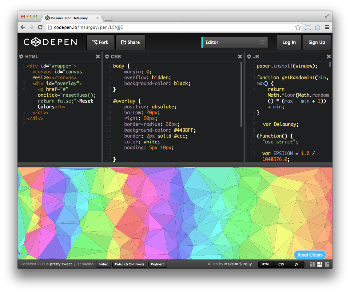 http://codepen.io/msurguy/pen/LENjjG
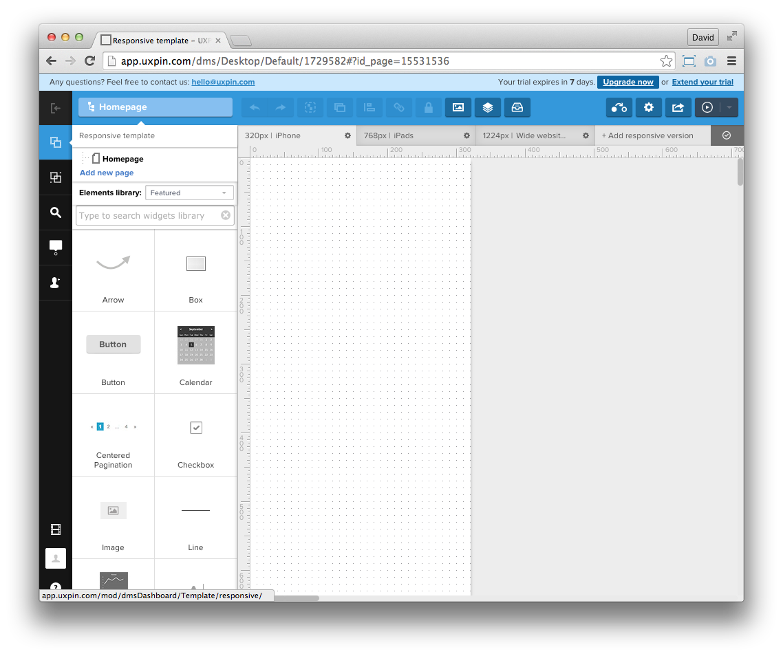 https://uxpin.com