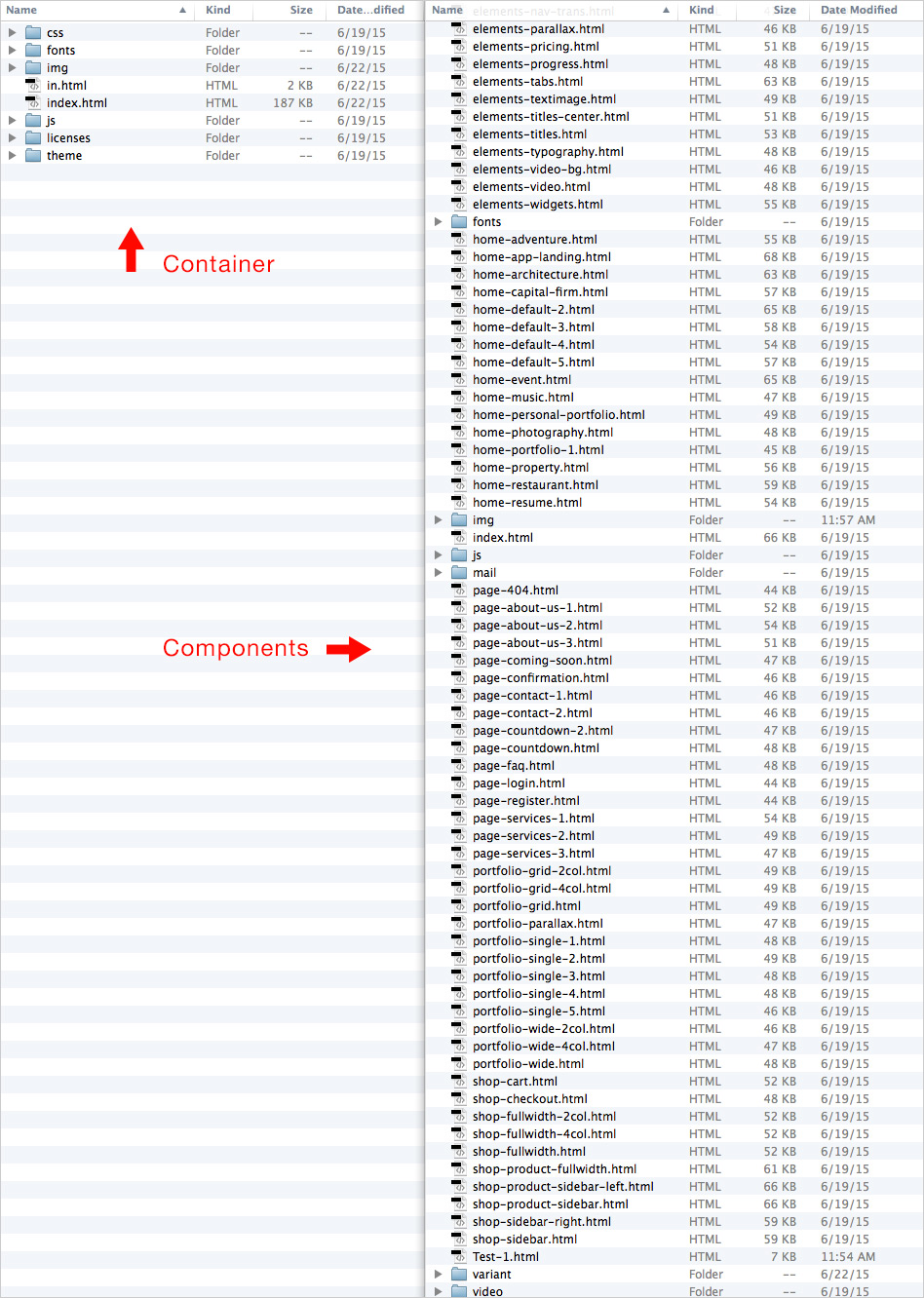
Building Library
The Building Library consists of Basic (Elements) and Advanced (Block) Components built inside of the Content Block panel that enable users to rapidly advance their development building capabilities.
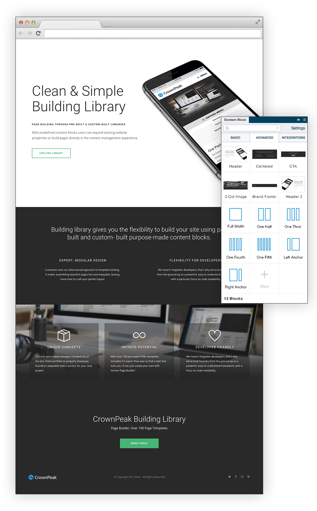
The "Content Block" panel expands the frontend development capabilities through a drag & drop interface.
Panel Components
Drag & Drop Building
Page Blocks
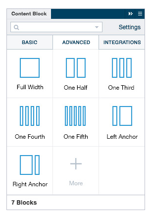
The Content Block Panel includes 3 sections:
BASIC (Elements) / ADVANCED (Blocks) / INTEGRATIONS (3rd Party)
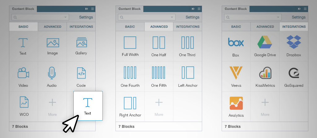
CONTENT BLOCKS
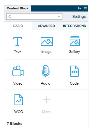
BASIC
The basic content block tab is made up of Elements that enable a user to drag blocks into a website that has been developed inside of the platform.
These Element Components work in two ways.
1. Pre-built
Template: Elements will adopt the styling of the template.
2. File > New: Elements will adopt the styling of the template.
PRE-BUILT LIST
The "Pre-Built" Elements are pre-defined by CrownPeak as building blocks for existing templates.
These Element Components do not have any styling.
CONTENT BLOCKS
ADVANCED
The advanced content block tab is made up of two parts seperated by "Custom-Built" and "Pre-Built" Block Components.
A user can drag Blocks into a website that has been developed inside of the platform.
These Block Components work in two ways.
1. Pre-built
Template: Blocks do not adopt the styling of the template.
2. File > New: Blocks will not adopt the styling of a template.
CUSTOM-BUILT LIST
The "Custom-Built" Blocks are built by the agency, developer or user who is has a pre-designed website. Unable to be defined by CrownPeak.
These Block Components have styling.
PRE-BUILT LIST
The "Pre-Built" Block (Components) are pre-defined by CrownPeak as building blocks for new templates.
These Block Components have styling.
CONTENT BLOCKS
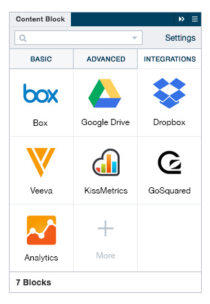
INTEGRATIONS
The integrations content block tab is made up of two parts seperated by "Custom-Built" and "Pre-Built".
Components that enable a user to drag blocks into a website that has been developed inside of the platform.
Page Building
These above elements are the building blocks for any successful page layout.
Use the BASIC tab for websites pre-built and implemented into the CMS. These blocks allow you to further exand or adjust your page.
Use the ADVANCED tab for websites pre-built or new websites inside the CMS. These blocks allow you to further exand or adjust your page as well as build page templates from the ground up.
Use the INTEGRATIONS tab for websites pre-built and implemented into the CMS. These blocks allow you to further exand or adjust your page.
Pre-Built Pages
Page Building
Component Code Snippets
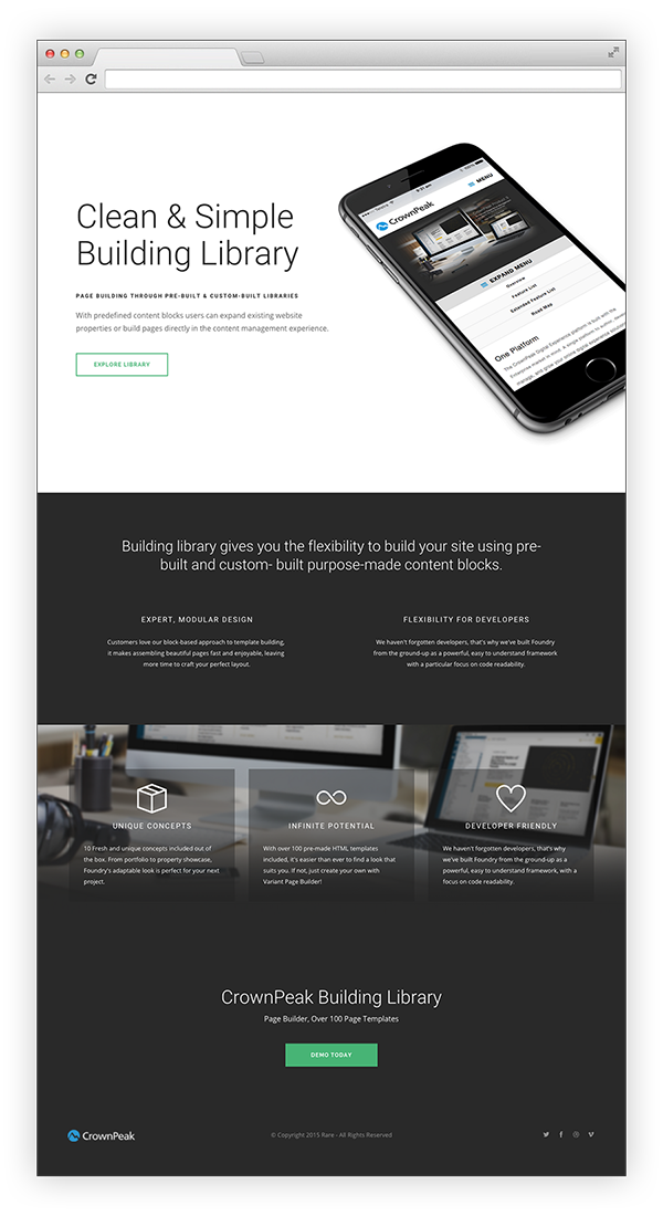
Component 1: Header

Clean & Simple
Building LibraryPAGE BUILDING THROUGH PRE-BUILT & CUSTOM-BUILT LIBRARIES
With predefined content blocks users can expand existing website properties or build pages directly in the content management experience.
ExploRE LIBRARY
Component 2: Centered Columns
Building library gives you the flexibility to build your site using pre-built and custom- built purpose-made content blocks.
Expert, Modular Design
Customers love our block-based approach to template building,
it makes assembling beautiful pages fast and enjoyable, leaving
more time to craft your perfect layout.Flexibility for Developers
We haven't forgotten developers, that's why we've built Foundry
from the ground-up as a powerful, easy to understand framework
with a particular focus on code readability.
Component 3: Icon Image Overlay

									Unique Concepts


									10 Fresh and unique concepts included out of the box. From portfolio to property showcase, Foundry's adaptable look is perfect for your next project.


									Infinite Potential


									With over 100 pre-made HTML templates included, it's easier than ever to find a look that suits you. If not, just create your own with Variant Page Builder!


									Developer Friendly


									We haven't forgotten developers, that's why we've built Foundry from the ground-up as a powerful, easy to understand framework, with a focus on code readability.