Platform Overview
Platform Overview
This page consists of multiple sections setup to display the functioning prototypes for the CrownPeak Platform.
Browser Prototype | Images Only | Developer Guide
Quick Glance
The screens below give a quick glance at a few user interfaces from the CrownPeak V3 Experience Manager.
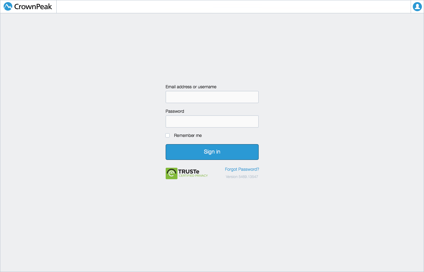
UI: Login
This screen displays the UI for the login page.
UI: Getting Started
This screen displays the UI for the getting started tour around the product.
UI: Marketing
This screen displays the UI for how we can market or new features and annoucements page.
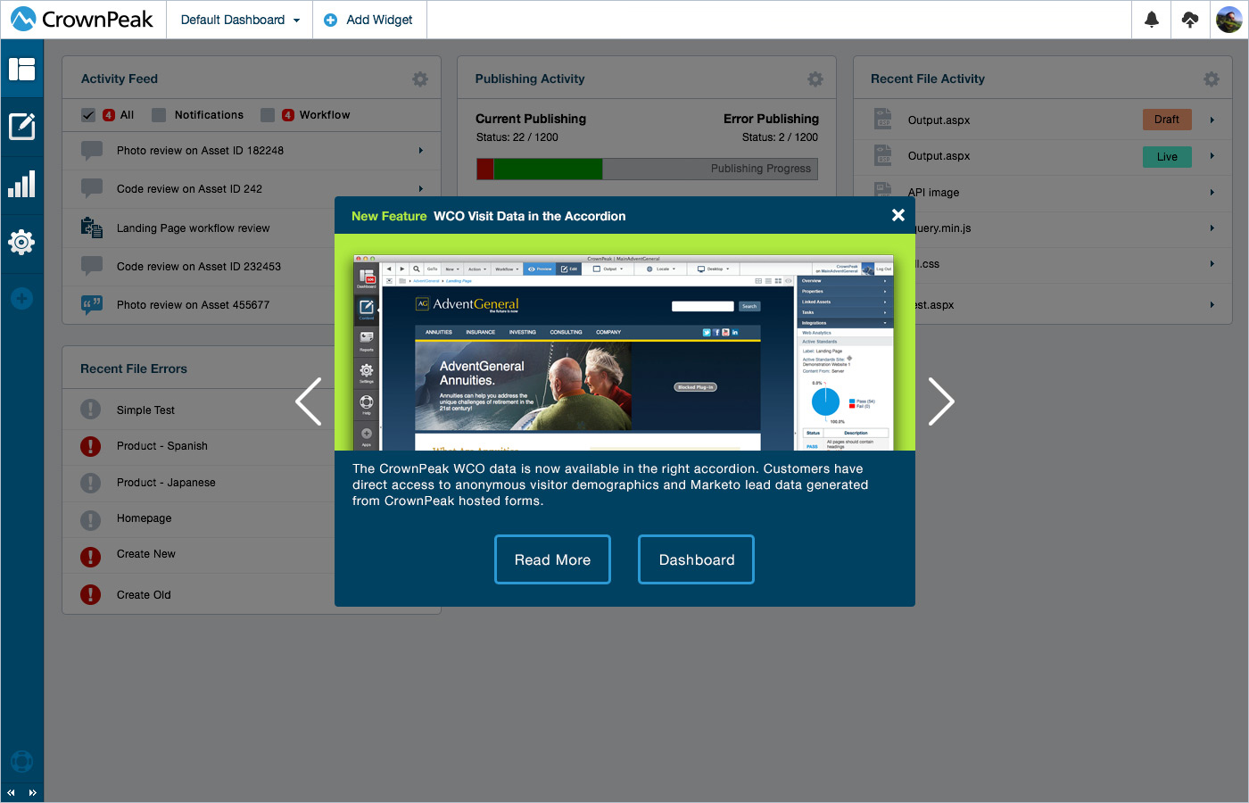
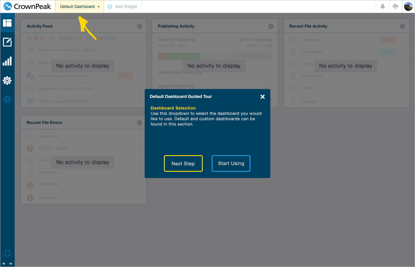
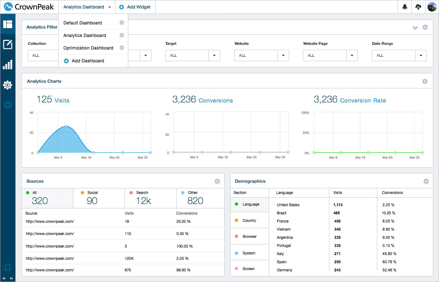
UI: Dashboard
This screen displays the UI for the Dashboard selection and Analytics view.
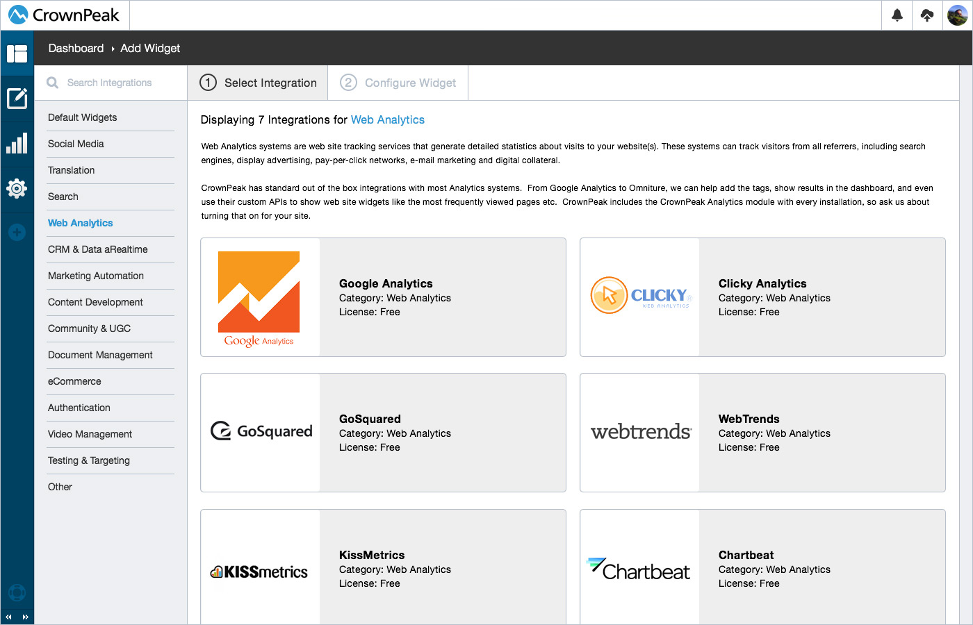
UI: Add New Widgets
This screen displays the UI for how we can add new widgets to a dashboard.
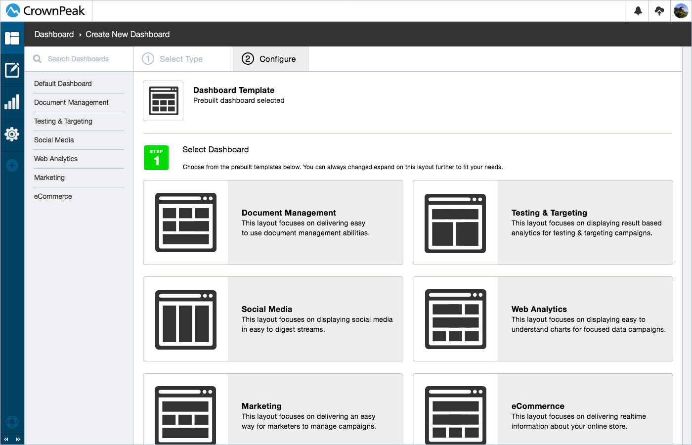
UI: New Prebuilt Dashboards
This screen displays the UI for how a user can select from predefined dashboards.
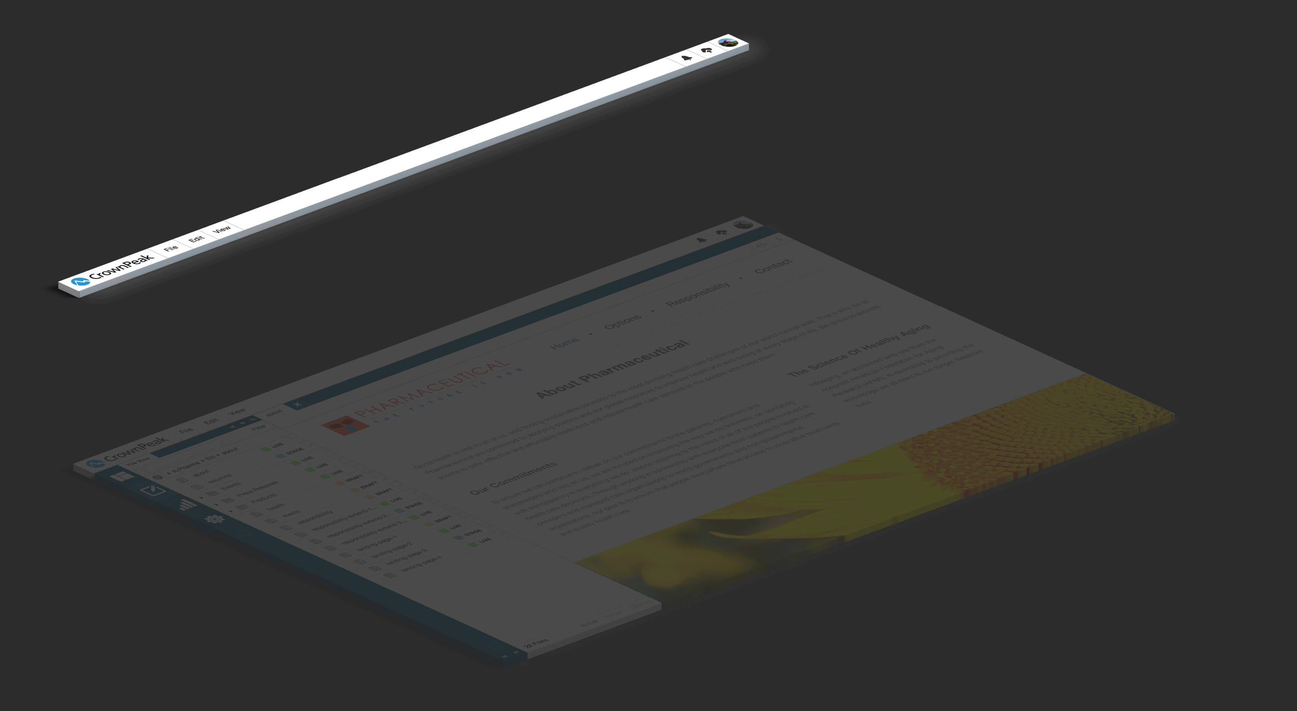
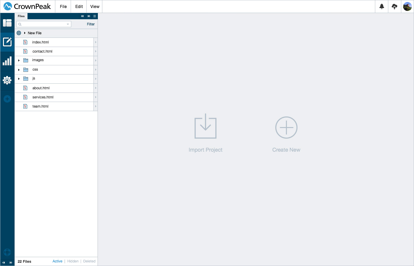
UI: Content View
This screen displays the UI for how the content section can be a blank canvas to configure.
UI: Content View w/ Left Column
This screen displays the UI for how the content section can have a left panel.
UI: Content View w/ Left & Right Column
This screen displays the UI for how the content section can have a left and right panel.
UI: Adding Panels
This screen displays the UI for adding panels to the interface for customization.
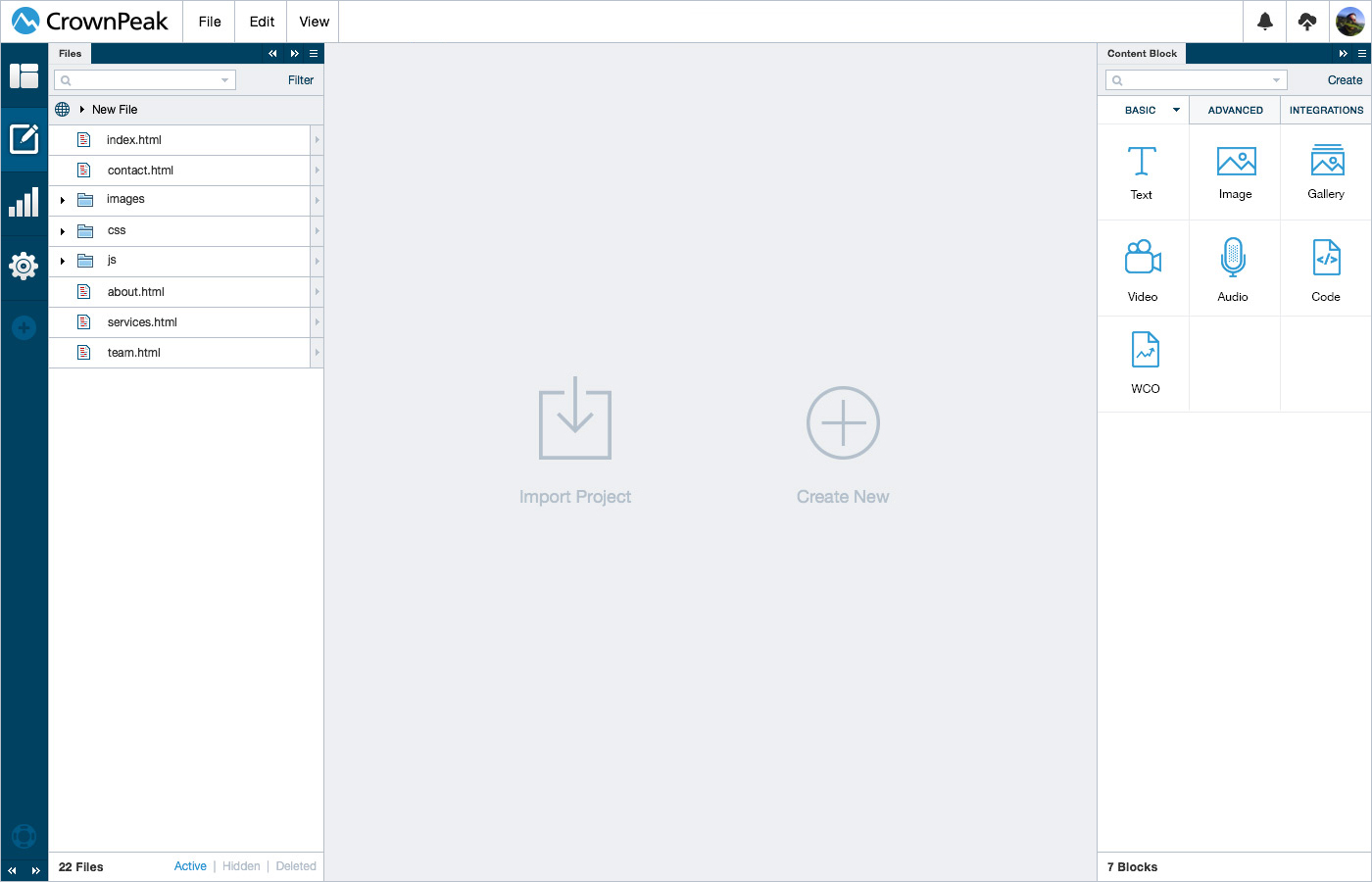
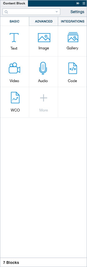
UI: Panel Content Blocks
UI for the content block panel.
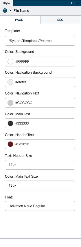
UI: Panel Style & SEO
UI for the style adjuster & seo panel.
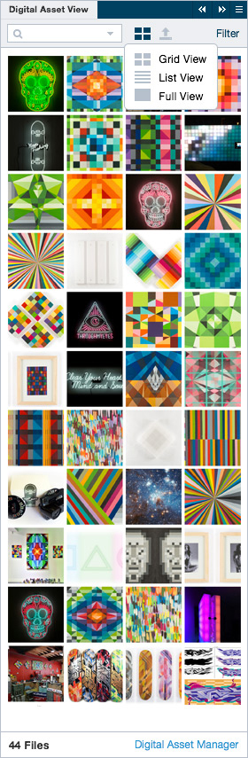
UI: Panel DAM
UI for the digital asset manager panel.
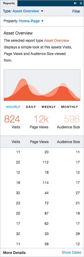
UI: Panel Reports
UI for the reporting panel.
More panels can be seen below in the panel prototype section.
Unlimited panel possibilities allow for a completely customizable interface for any user of the cms. By building panels we can deliver a solution for almost any persona who uses the cms.
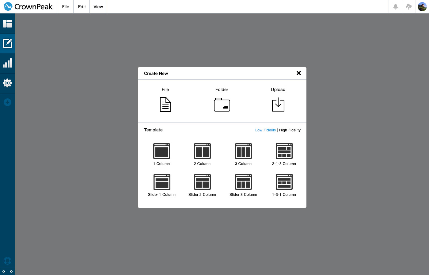
UI: Create New
This screen displays the UI for creating a new File, Folder, Upload or Template.
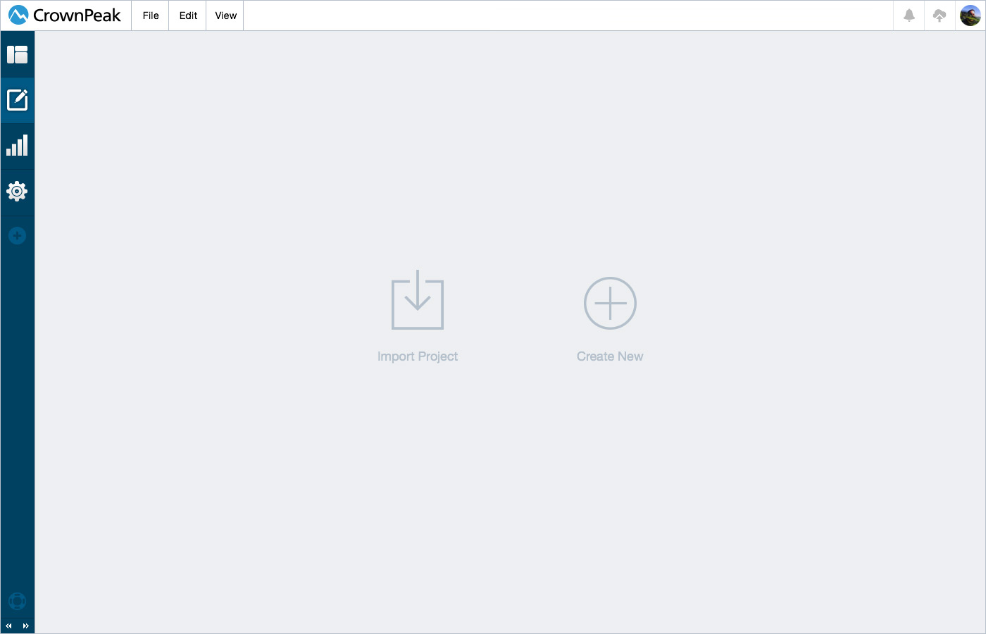
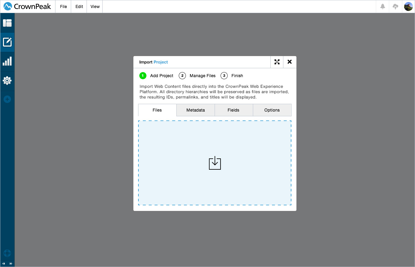
UI: Import Project
This screen displays the UI for importing a pre developed website or application into the cms.
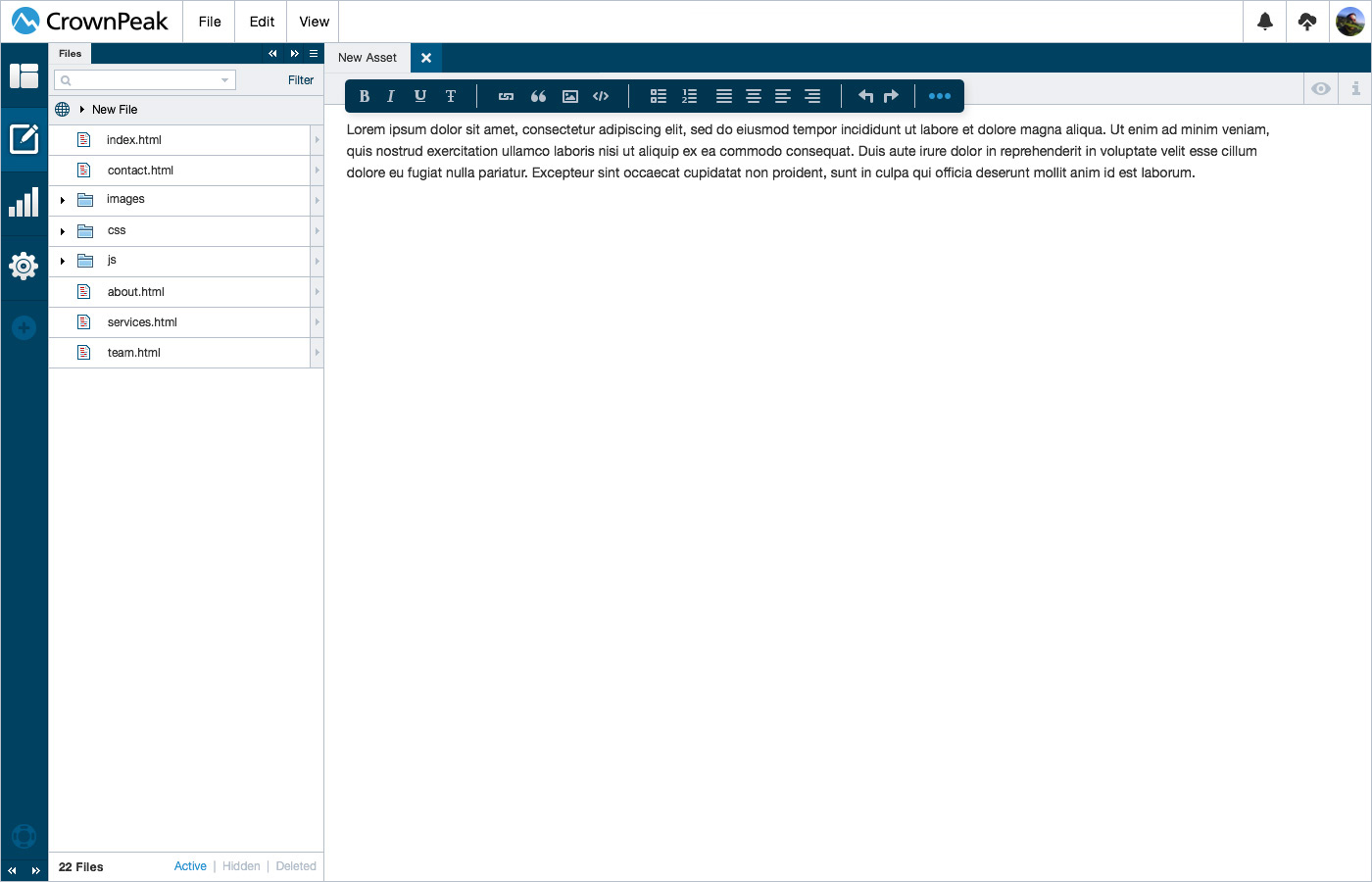
UI: Basic WYSIWYG
This screen displays the UI for a basic WYSIWYG as you are editing.
UI: Drag Component from Panel
This screen displays the UI for dragging a predefined component to the page.
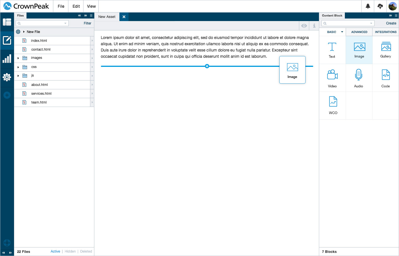
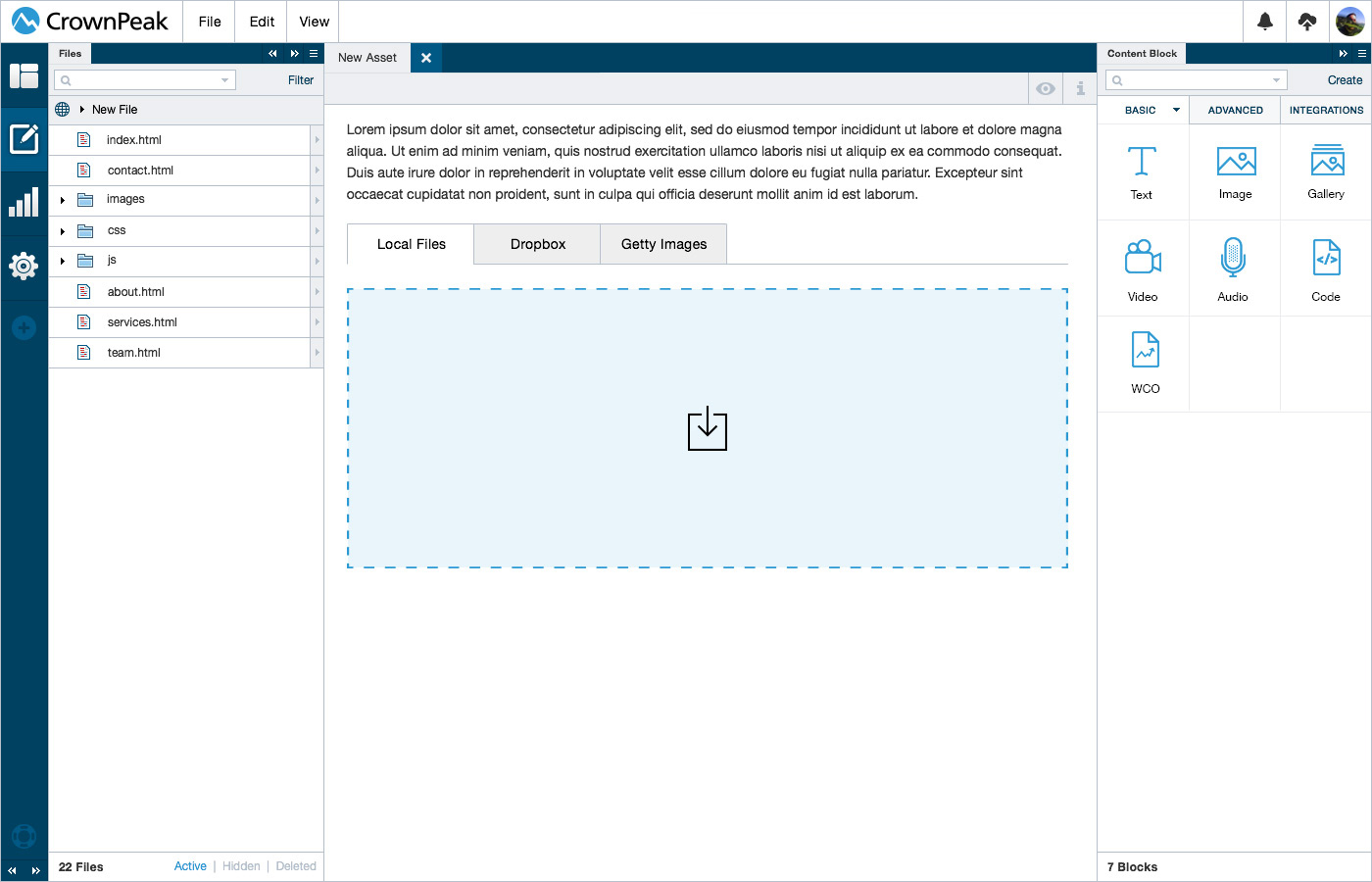
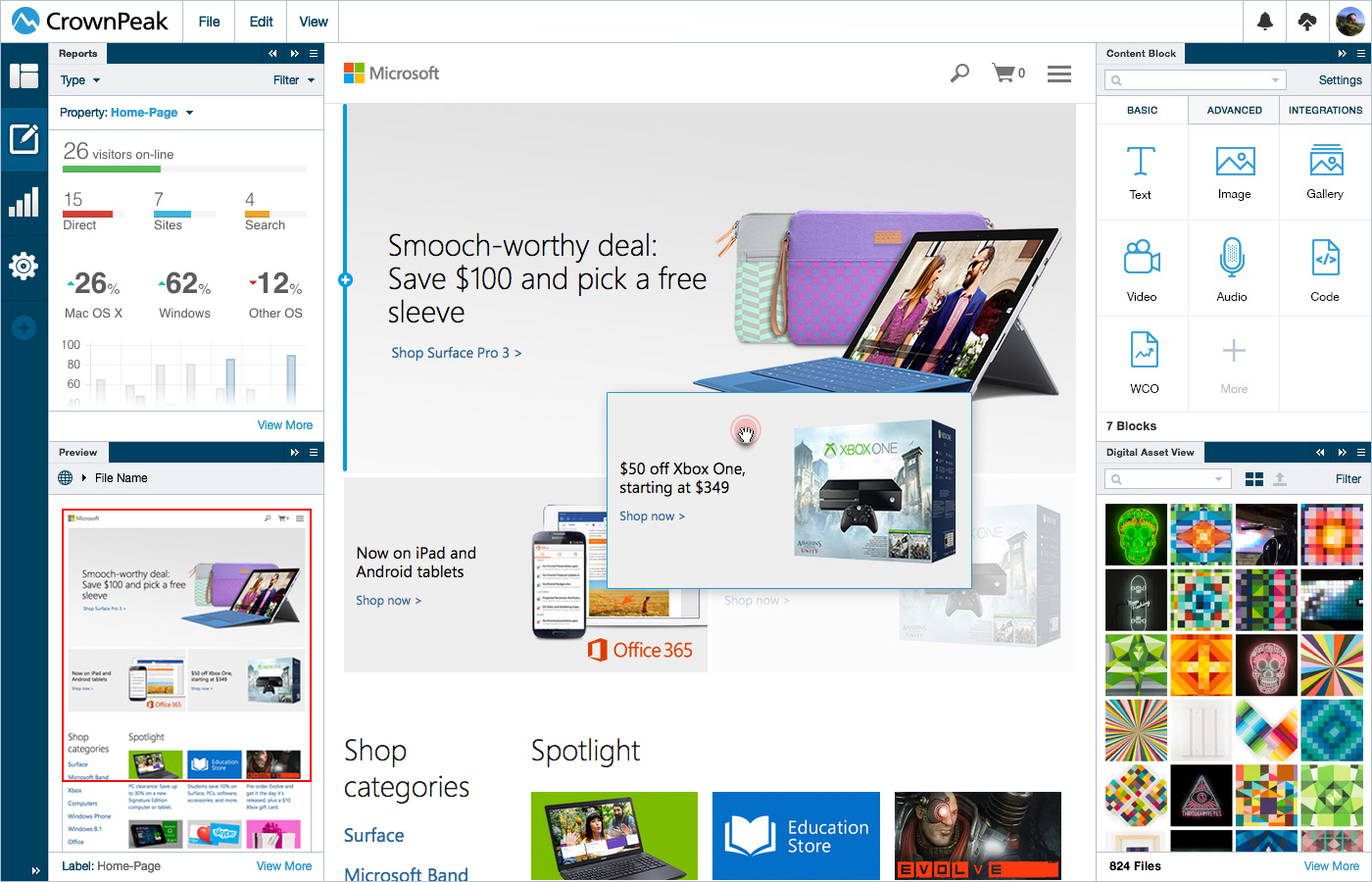
UI: Image Selector
This screen displays the UI for adding an image once the component is added to the page.
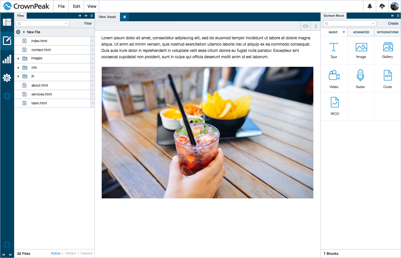
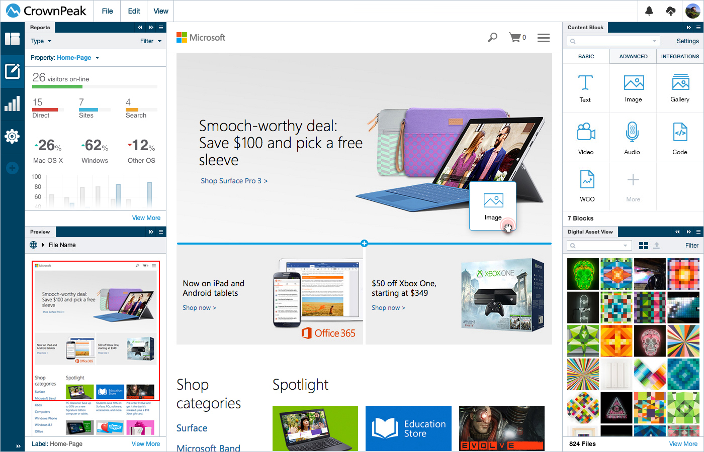
UI: Image Selected
This screen displays the UI for once the image has been selected.
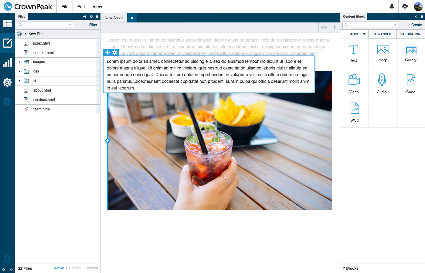
UI: Drag & Drop
This screen displays the UI for moving a block of text next to the image block.
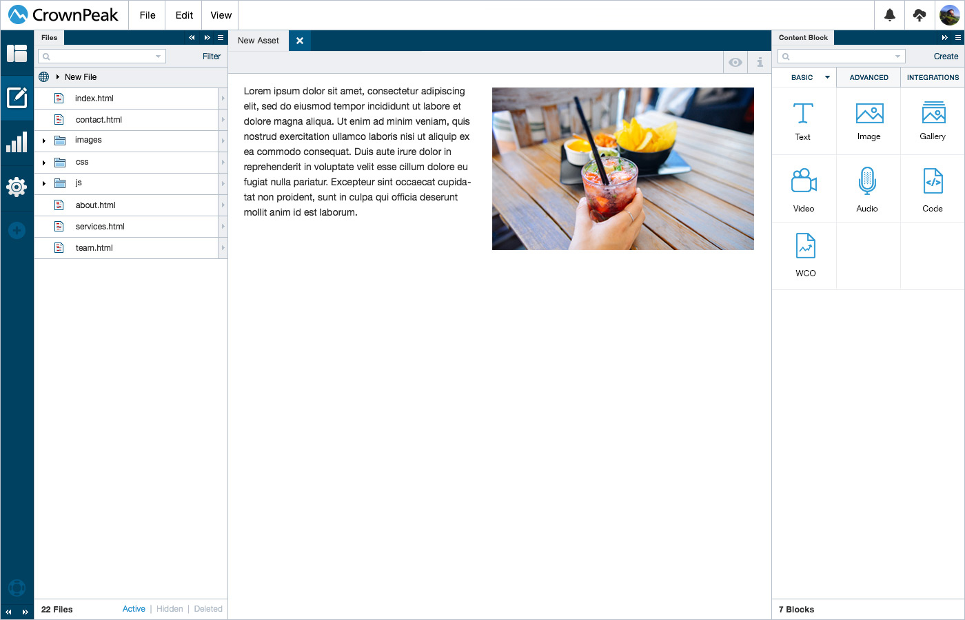
UI: Auto Format
This screen displays the UI for how the content will auto format into place.
UI: Drag Current Content
Content already on a page will be able to be dragged anywhere the blue highlight displays.
UI: Drag Content Block
Dragging a predefined content block to a page the blue highlight displays where it can be placed.
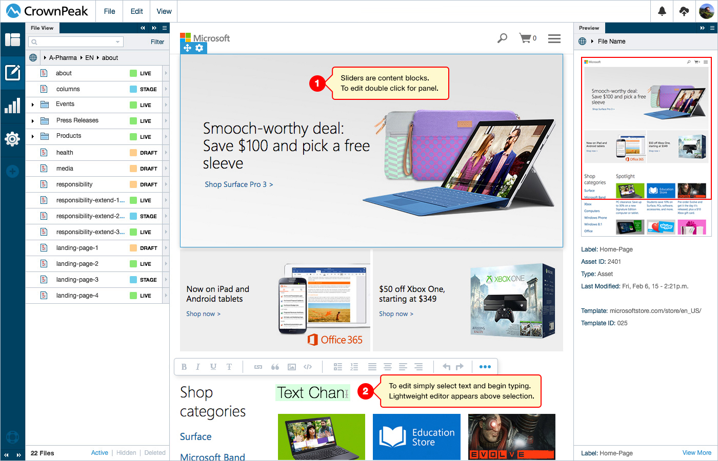
UI: Edit Content
This screen displays the UI for editing inline content. (1) Example of a slider (2) Example of direct editing.
More editing information can be found in the Content Editing section.
The developer will have the ability to define what items display on the WYSIWYG. We will have two different states for the WYSIWYG one for simple view one for expanded view. The color of the WYSIWYG is also customizable to ensure it is able to be easily seen no matter what the color of the website. On Desktop mouse hover over a content block will display a field showing thatit can be dragged or edited. On Desktop for text a user will simply click and edit. On Desktop for an image a user will need to click twice to trigger the editing interface. On Mobile for text the user will tap once to select the content block, tap twice to edit and long hold to drag.
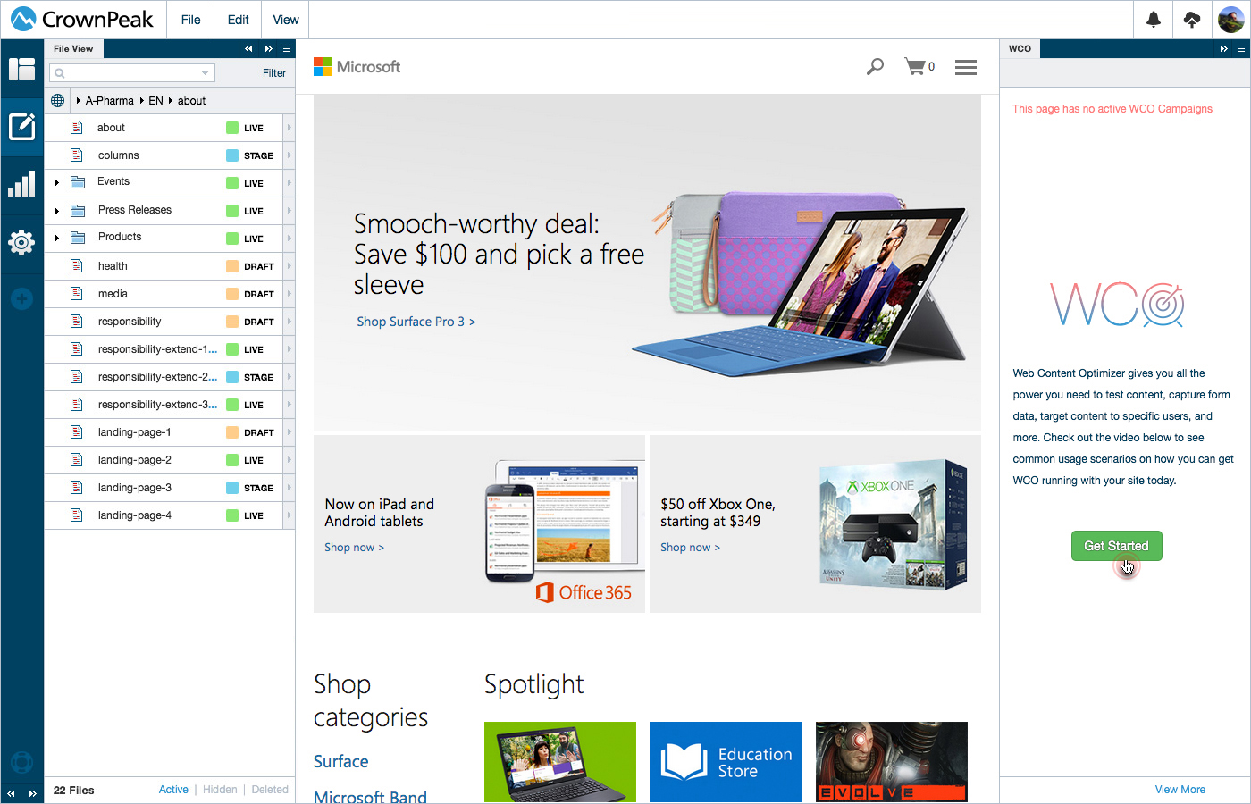
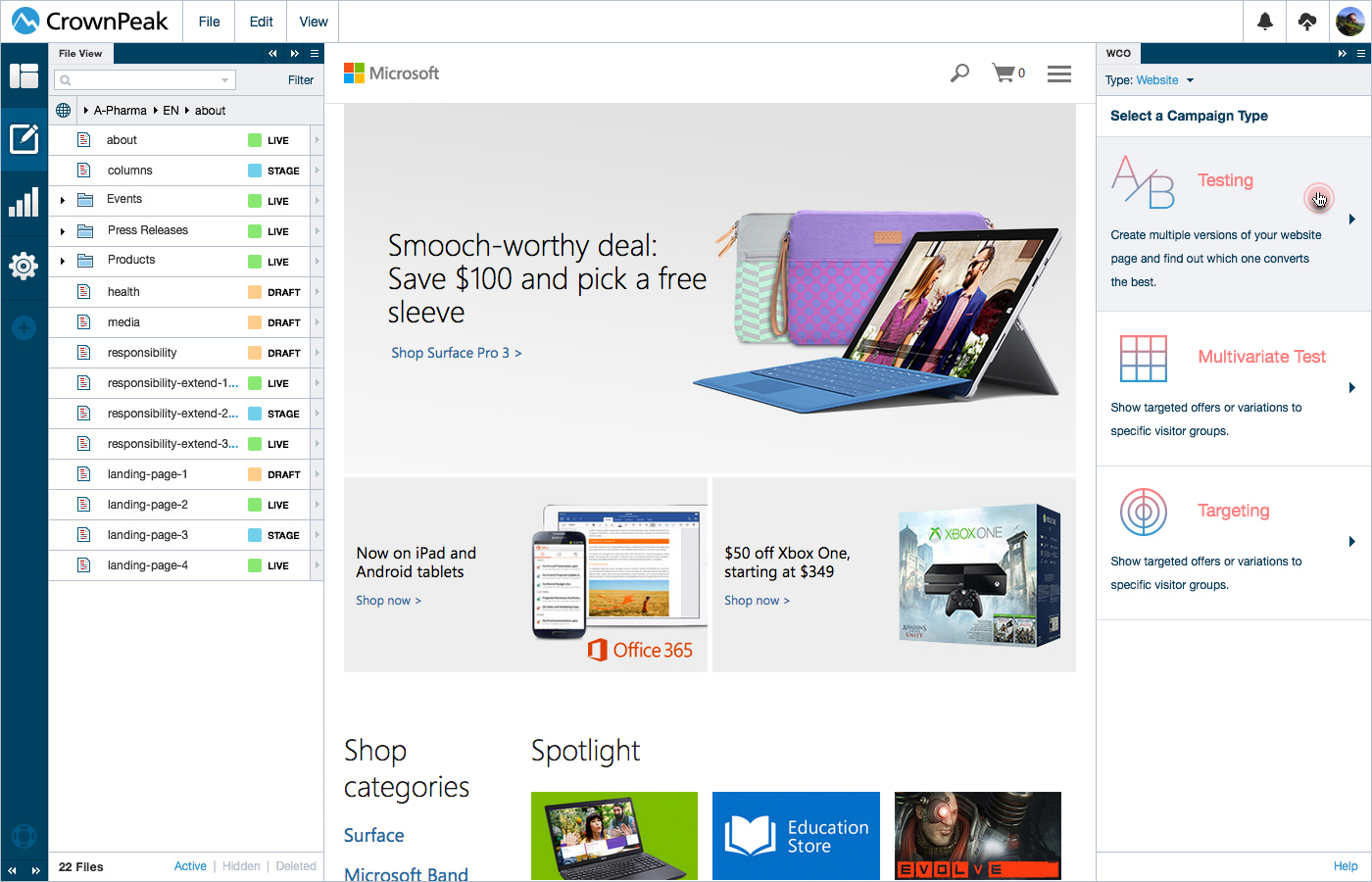
UI: WCO
This screen displays the UI for starting a WCO Campaign Start.
UI: WCO Campaign Type
This screen displays the UI for selecting a WCO Campaign type.
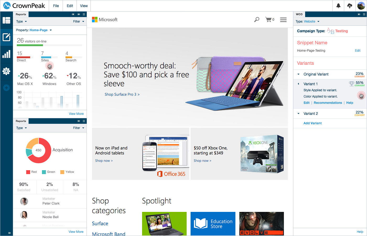
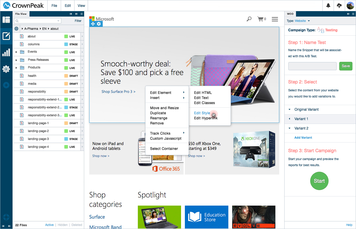
UI: WCO Testing
This screen displays the UI for viewing and customizing variants.
UI: WCO Testing Review and Adjust
This screen displays the UI for viewing an active campaign showing the reports, winning variants and ability to adjust for results.